AntennaPod version 2.3.0 feedback

You can disable the checkbox “Show in main list” on all of your subscriptions. Then it only displays folders. (only works if each subscription is in at least one folder. When it is not, it is automatically shown in the main list)

1 Like

Yeah, I saw that. But with 30 or so podcasts that’s a lot of extra taps :slight_smile:

Two other things I noticed:

  • When the screen is off, I pause playback via my headset, and then after a while turn on the screen, I can see the end of the animation of the play button turning into a pause button. I guess that’s because the screen is redrawn only when turning on my screen again (?)
  • When I have the player open and positioned in the shownotes, screen turns off, and then I turn on the screen, I see a flash of the episode image. That flash makes you think “what’s happening”.

Yes that’s it, noticed that as well, but I think that’s fine

I have 2.3 beta 2, but could not figure out that there is a tagging feature in subscription. @keunes , is there instructions on the AP website about how to use it?

Update: I figured it out, it is in the feed settings where I can add tags and they will show up at the bottom of the subscription side bar. (Funny: i had to read the code to figure it out, or if I paid attention to the feed settings screen it would have helped)

Minor issue indeed, but I think it would still be nice if it were improved (to make it feel a bit more polished :innocent:

Yeah, it’s not super-discoverable. We should

  • do something in the UI to make it more prominent. Not sure how, though. We could
    • move it higher up in the settings (in any case it should be above authentication as tags are more likely to be used)
    • introduce a tags manager dialog and add a ‘Manage tags’ item on the overflow menu in the Subscriptions screen
  • introduce a ‘what’s new’ dialog that lists the new features for the user, with one sentence explanation if necessary
  • add indeed info to the documentation, I would say ‘Getting started’ or ‘General’

The feedback here should probably be split into individual issues on GitHub. Otherwise, it will soon get hard to follow a discussion.

Is it the episode image page or does it just scroll the shownotes (which might contain an image) to the top for a second?

:+1:

I was listening Podcasting 2.0 and saw a red flash. The shownotes don’t contain an image. So it was definitely the episode cover.

Quick feedback on new player screen :

  • info button feels dangerously close to time bar. There should be an equal amount between it and time bar than what there is beetween play button and time bar.
  • Is it normal that you can tap on episode title ? It does nothing ?

Yea tapping on podcasts title opens the feed, on episode title actually scrolls it vertically if it’s longer than 2 lines.
Both are copied into clipboard on long click.
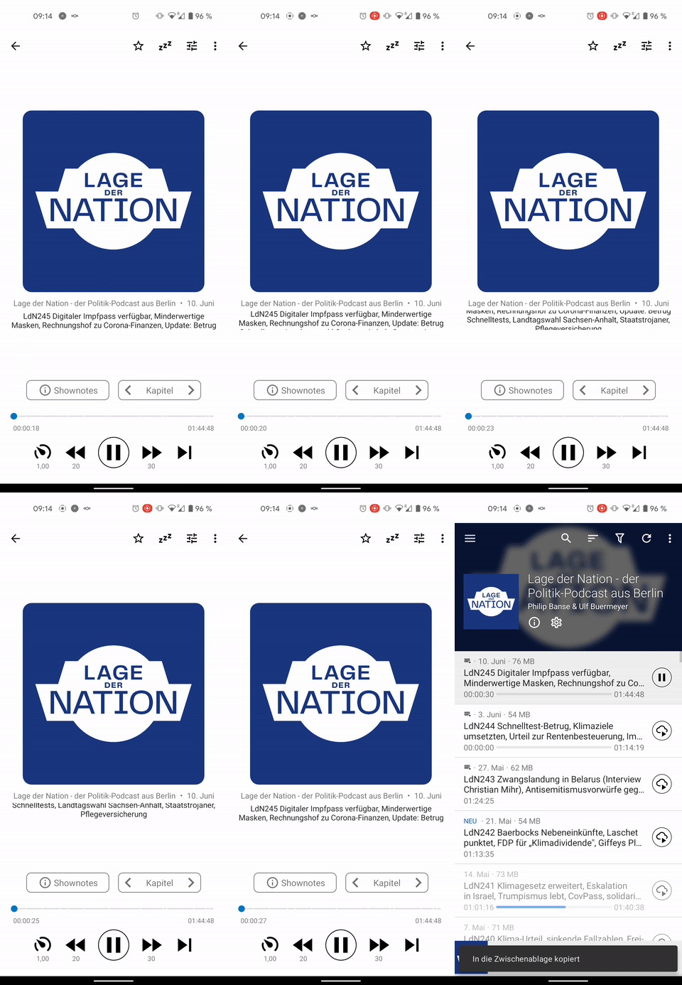
ezgif-3-c148cb0b8957

Why ‘dangerously close’? Do you think it you might mis-tap and accidentally change position when trying to open the Shownotes?

I think that visually it looks great as it is (I can imagine the distance to the progress bar is increased a bit, but I wouldn’t make it centred between the timer and episode title)

1 Like

Exactly!

Some more text to bypass minimum characters required for a post!

1 Like

I think it’s unfounded, then the play/pause would also be “dangerously close” besides: you can just swipe vertically to get to the shownotes :wink:

My point was that space from time bar should be the same for pause button and info button.
Info button seems to me closer to time bar than play button.

1 Like

I think that’s actually not true if you account for the time display

Anyway, I’m using it for a while now and never had an issue with the timeline, let’s see what if the beta testers experience any :slight_smile:

Your measurement is beetween play and time code not bar.
What I fear is to tap on time bar and change position instead of taping info.

You can also swipe up, that way you don’t have to tap on the shownotes button :wink:

ezgif-2-c5a9ba994e74

1 Like

I also feel that the risk is limited because the Shownotes button is quite big – it’s likely that you’ll hit the centre of the button. And, trying it out, you really need to be quite close to the progress bar in order to change it. On my phone at least you’re quite far off of the Shownotes button.

1 Like

Anyone else missing player controls entirely on the widget with this version? I can still hit the far right to play/pause, but the button icon is gone.

Yeah, I noticed that too. Will be fixed in beta3, which is currently rolling out.