### Author:  [@ueen](https://forum.antennapod.org/u/ueen)
#### Post date: [January 3, 2024, 7:58am UTC](https://forum.antennapod.org/t/home-feature-expanable-episodes-list-and-inbox/3891/1 "2024-01-03T07:58:13Z")
lengthy discussion here:
>
>
> Expand inbox and episodes sections to scrollable lists if enough space on home.
> …
>
> \_This is a minimal working version with a few kinks that would need ironing out, but i'll do that only if theres a prospect of merging this\_
>
> \_(Maybe the home settings dialog would need to be fixed for this, because its not really clear that the suprise section would expand to episodes list, i think this is just a language/design issue, not a concetual one...or it might be - then there could be seperate inbox&episode expandable list sections that are disabled by default and only are enableable if theres only one other section selected)\_
>
> closes https://github.com/AntennaPod/AntennaPod/issues/6229
just see for your self 🙂
[ ](https://www.youtube.com/watch?v=jVgvThIoH6g)
---
### Author:  [@ueen](https://forum.antennapod.org/u/ueen)
#### Post date: [January 3, 2024, 8:06am UTC](https://forum.antennapod.org/t/home-feature-expanable-episodes-list-and-inbox/3891/2 "2024-01-03T08:06:26Z")
_I’m unsure why there is such fierce resistance to this feature, i find it extremly powerful and used it every day for 1-2 years in my fork of AP and love it!_
_I find the above proposed UI/UX very clean and unobtrusive, nobody has to use it, but its an aweseome customization for home that opens up enterily new ways of using AP, and i highly recommend trying it for a few days 🙂_
---
### Author:  [@Matth78](https://forum.antennapod.org/u/Matth78)
#### Post date: [January 6, 2024, 9:23am UTC](https://forum.antennapod.org/t/home-feature-expanable-episodes-list-and-inbox/3891/3 "2024-01-06T09:23:38Z")
For what it is worth my main screen is queue.
Although I find home nice it doesn’t work for me. I am going to explain why hoping I am somewhat representative of users whose also use queue as main screen.
First my everyday workflow with AntennaPod :
- of course I listen to podcast, starting play from mini player
- check for new episodes in inbox : now that there is not anymore a set time I turned on notification for podcasts I really like and always want to listen to. Notification of new episodes is what triggers checking inbox. Too bad notification of episodes for only one podcast don’t go directly to inbox.
- download episodes (which are added to the queue) and then reordering queue quite often. I manage my queue to balance between episodes I always want to listen and others. My goal is to minimize having no preferred episodes available and not grouping similar podcasts.
What prevents me to use home :
- continue to listen is redundant for me. I will only use it to play an episode but there is already mini player at bottom. If ever I wanted first to second episodes I would want to listen to first one afterwards. So it would requires reordering queue. Besides without scrolling only 3 episodes are visible. Given my worflow a list and one you can reorder is better suited.
- news : that one is really nice because it allows direct download or a quick access to inbox. But if “continue to listen” was a list it would need to be the top item. So I feel home is missing a way to reorder sections / items.
- other items : I found them nice but it’s likely I won’t use them. So I would disable them but it would make home quite empty.
tl;dr : For my workflow home should be news at top and below queue (with episodes in a list you can reorder)
What it actually means is that I am happy with queue and only thing missing imho is quick access to inbox.
Bottom navigation would allow it. Less vertical space would be available but it is also true with home screen as you display multiple sections / items.
@ueen I wonder if actually your workflow is not similar to mine given your proposals. Even though you don’t seem in favor of bottom navigation maybe actually it would fit your workflow?
---
### Author:  [@ueen](https://forum.antennapod.org/u/ueen)
#### Post date: [January 6, 2024, 12:17pm UTC](https://forum.antennapod.org/t/home-feature-expanable-episodes-list-and-inbox/3891/4 "2024-01-06T12:17:53Z")
True, sounds similar and queue could also be added as an expandable list to home, great suggestion!
I do believe with enough customizability home will work for (nearly) everyone one will create a one screen for dailyuse - which is definitively a goal of mine: not unnecessarily tap or switch screens 🙂
@Matth78 I agree that out workflow is kinda similar and I would day you wouldn’t need the bottom navigation with expandable queue on home. Which will require reordering sections, which should be implemented as well.
---
### Author:  [@keunes](https://forum.antennapod.org/u/keunes)
#### Post date: [January 6, 2024, 9:05pm UTC](https://forum.antennapod.org/t/home-feature-expanable-episodes-list-and-inbox/3891/5 "2024-01-06T21:05:12Z")
> [@ueen](#):
>
> _I’m unsure why there is such fierce resistance to this feature, i find it extremly powerful and used it every day for 1-2 years in my fork of AP and love it!_
I don’t think there’s ‘fierce resistance to this feature’. We even created a GitHub issue about it (after it was excluded from the first Home implementation): [Make 2nd section fill screen space on Home if only 2 sections are present · Issue #6229 · AntennaPod/AntennaPod · GitHub](https://github.com/AntennaPod/AntennaPod/issues/6229). The discussion revolves around _how_ it’s implemented in terms of UX (as I’ve already mentioned in the PR).
So, thanks for actually enabling that discussion with a screen recording. Because, honestly, from your written explanation I understood something different from what you actually implemented.
> [@Matth78](#):
>
> So I feel home is missing a way to reorder sections / items.
The idea was to make this possible indeed - when implementing the Home screen, this issue was created: [Make it possible to re-order sections on the home screen · Issue #6068 · AntennaPod/AntennaPod · GitHub](https://github.com/AntennaPod/AntennaPod/issues/6068)
> [@Matth78](#):
>
> But if “continue to listen” was a list it would need to be the top item.
Not sure that would work - if it’s made a vertical list (i.e. the Queue), I think it only makes sense at the bottom half of the screen (as in the video). Somehow having a long list on top and a horizontal item on the bottom feels odd (hard to explain, though).
> [@Matth78](#):
>
> tl;dr : For my workflow home should be news at top and below queue (with episodes in a list you can reorder
> …
> Bottom navigation would allow it.
I understand your use-case, and what you’re suggesting with Inbox + Queue sections. But having a single screen with two lists I think isn’t the best solution, for the reasons you mention (bottom nav + limited screen space).
* * *
So, now my own thoughts:
It looks good and I understand the logic now of enabling/disabling sections and changing display depending on it. As you noted @ueen it could do with a little text in the config dialog explaining how it works. I would also add still the title + link to screen for the second section (which you maybe also noted already, don’t recall).
However, I have two comments on this approach to the ‘configure’ UX:
1. ‘What’s new’ and ‘Inbox’ are overlapping; they’re duplicate. I would really like to avoid that.
- Reason to avoid duplication: users will request more screens/lists to be ‘expandable’ in the Home screen.
- @Matth78 already requested to have the Queue as a long list - and I agree with you that that’d be nice. A good example of the type of requests that will undoubtedly come.
- In the end all sections could be expandable, making the list too long for a dialog: Continue listening/Queue; See what’s new/Inbox; Get surprised/Episodes; Check your classics/Subscriptions; Manage downloads/Downloads (10 options total).
- Less important, but still: when opening the configuration dialog for the first time, the user might not realise that ‘What’s new’ and ‘Inbox’ concern the same data and select both - unintentionally duplicating information on their Home screen. (They would probably realise after saving, at which point they can of course re-configure. But it’d be better to avoid this.)
- Solution (as per the feature request): There is a single list of sections. If only two are activated expand the bottom one (i.e. make it look like you developed already). For further details, please read the FR - it’s not long.
- This approach avoids duplication in the dialog’s list of sections and circumvents my second comment.
- No idea though if such implementation is feasible technically. Curious to hear a developer’s perspective on this.
2. We’ll want the sections to be re-orderable, as per the issue linked above.
- For UX simplicity, it’d be better to have a single list of reorderable items, rather than two lists where the first is reorderable and the second is not.
- If the ‘solution’ from point 1 is implemented and it is not (yet) possible to reorder items, only a limited set of combinations (short list + long list, e.g. Continue listening + Inbox) is possible. We could probably still make the main combinations work, by reordering the items in the options list.
- Again, no idea about complexity of implementation. I can totally see this as a later improvement on top of the ‘split Home screen’ (which is why we created 2 separate GH issues).
Hope that makes sense; that I well explained my UX concerns. Looking forward to your thoughts 🙂
---
### Author:  [@Matth78](https://forum.antennapod.org/u/Matth78)
#### Post date: [January 6, 2024, 10:38pm UTC](https://forum.antennapod.org/t/home-feature-expanable-episodes-list-and-inbox/3891/6 "2024-01-06T22:38:26Z")
> [@keunes](#):
>
> > [@Matth78](#):
> >
> > But if “continue to listen” was a list it would need to be the top item.
>
> Not sure that would work - if it’s made a vertical list (i.e. the Queue), I think it only makes sense at the bottom half of the screen (as in the video). Somehow having a long list on top and a horizontal item on the bottom feels odd (hard to explain, though).
That’s what I meant : at top new episodes horizontal list, then queue / continue to listen as a vertical list.
But all in all queue + bottom navigation for quick access would probably be what’s best for my workflow.
---
### Author:  [@ueen](https://forum.antennapod.org/u/ueen)
#### Post date: [January 7, 2024, 1:20am UTC](https://forum.antennapod.org/t/home-feature-expanable-episodes-list-and-inbox/3891/7 "2024-01-07T01:20:36Z")
Had expand bottom section if only two selected before, but it’s quite unexpected UXwise that eg “get surprises” expands to episodes list when only looking at home settings, maybe rename the settings list to the associated screens?
About reorder, also something I implemented 2 years ago already at some point, be nice but Im not so keen on doing everything twice 😉
---
### Author:  [@ByteHamster](https://forum.antennapod.org/u/ByteHamster)
#### Post date: [January 7, 2024, 1:26am UTC](https://forum.antennapod.org/t/home-feature-expanable-episodes-list-and-inbox/3891/8 "2024-01-07T01:26:54Z")
Another way to implement this would be a drop-down list for “expanded section below” or something like this. Then it’s maybe more clear that it shows a screen, not a home section.
How would the toolbar work in this combined screen? To me, it feels a bit strange to have the “home” toolbar options on a screen that looks mostly like the “all episodes” screen.
---
### Author:  [@ueen](https://forum.antennapod.org/u/ueen)
#### Post date: [January 7, 2024, 4:28am UTC](https://forum.antennapod.org/t/home-feature-expanable-episodes-list-and-inbox/3891/9 "2024-01-07T04:28:39Z")
Toolbar would stay, home is home.
The dropdown is the exact solution I implemented 2 years ago and was rejected for some reason. I think the solution with greyed out checkbooks is not to bad, it could be separated visually but I wouldn’t put too much thought into this anyhow, it’s easy enough to just try out and see what happens (discoverability) and then we just have to beta and see whats too improve.
---
### Author:  [@ByteHamster](https://forum.antennapod.org/u/ByteHamster)
#### Post date: [January 7, 2024, 1:49pm UTC](https://forum.antennapod.org/t/home-feature-expanable-episodes-list-and-inbox/3891/10 "2024-01-07T13:49:32Z")
> [@ueen](#):
>
> The dropdown is the exact solution I implemented 2 years ago and was rejected for some reason.
I don’t remember exactly, but was it actually rejected? I though I just wanted to do the home screen in simple steps instead of doing everything at once in a huge PR, so I simplified the PR a lot, removing some of the features. But maybe I also remember incorrectly.
> [@ueen](#):
>
> I think the solution with greyed out checkbooks is not to bad
I didn’t look at it yet (I’m on a work trip currently), will do when I get back home
---
### Author:  [@ueen](https://forum.antennapod.org/u/ueen)
#### Post date: [January 13, 2024, 5:26pm UTC](https://forum.antennapod.org/t/home-feature-expanable-episodes-list-and-inbox/3891/11 "2024-01-13T17:26:32Z")
Community call:
Dropdown in settings
and add heading
---
### Author:  [@ueen](https://forum.antennapod.org/u/ueen)
#### Post date: [January 25, 2024, 12:38pm UTC](https://forum.antennapod.org/t/home-feature-expanable-episodes-list-and-inbox/3891/12 "2024-01-25T12:38:26Z")
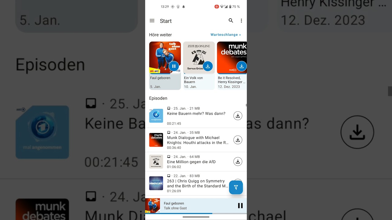
Current Version/Vision (plus fast filter and cover-\>feed)
[ ](https://www.youtube.com/watch?v=fcxEi-WQC2c)
@keunes i feel like with the heading (which I like & would keep) that the expandable section might be a tiny bit to small not sure how too deal with this, I feel maybe the queue cards are to big in general… Maybe get rid of the date or make the cover a few dp smaller or smth? [resize home cards by ueen · Pull Request #6898 · AntennaPod/AntennaPod · GitHub](https://github.com/AntennaPod/AntennaPod/pull/6898)
---
### Author:  [@system](https://forum.antennapod.org/u/system)
#### Post date: [May 24, 2024, 12:38pm UTC](https://forum.antennapod.org/t/home-feature-expanable-episodes-list-and-inbox/3891/13 "2024-05-24T12:38:59Z")
This topic was automatically closed 120 days after the last reply. New replies are no longer allowed.