Home screen proposal

At least if there are no local search results, we should display something like No results in your subscriptions. [Search for new podcasts]. As your mock-up makes local search a lot more prominent, I wonder if we still want some kind of button to search online even if there are local results. If one uses the search bar, they could otherwise be disappointed and think that AntennaPod’s database is too small.

I refer to the home screen. The lines in the “latest” section show the podcast title and move the other information around. That will be a bit of a pain to implement cleanly. Also, to be honest, I want to try to be as consistent as possible. AntennaPod 1.x had 3 different layouts for the episode lists with only tiny differences. Users complained about that (#3548 #3003).

I recently saw a comment on Google Play by someone claiming that AntennaPod needs more and more storage space over time. My guess would be that they just never delete downloads. Having the screen displayed more prominently could help there.
Personally, I use the downloads screen to (manually) delete played episodes. I don’t trust in the auto-delete feature to always behave like I expect it to behave ^^ It really needs a rewrite. Anyway, not sure if the downloads section should show “delete” buttons or “play” buttons on the home screen.

Not a fan, to be honest. See Feature request: Button to download and play · Issue #3034 · AntennaPod/AntennaPod · GitHub

1 Like

Yup, good idea. (I think AntennaPod could benefit from some more empty-state-screens in other places, too - but that’s another story.)

I wouldn’t include it on the home screen directly. If anywhere, it could be a button in the search results screen. Maybe next to the last podcast miniature at the top?

Ah, sorry. Right. That’s mainly because I copied two episode list entries from different other mock-ups. I think we need two ‘forms’:

  • episodes that have not started playback: podcast title above, rest of the info below episode title
  • episodes that have started playback or were completed: podcast title & date above the episode title, position and duration below episode title (filesize omitted)

Main point here: give more importance to podcast title

As you already describe, there’s another screen for that problem. If an important function (autodelete) doesn’t work easily/as expected/as desired, that cause should be tackled. For me, to be honest, adding another section to a screen is just tackling symptoms (and as it doesn’t serve the screen’s purpose - initiating playback - will just distract most users).

(Don’t feel strong about ‘Download & play’ button, so dropping that here.)

1 Like

Sounds good :+1: If there are no results, it will then automatically be displayed more prominently.

Hmm. There already is the icon. I am not a fan of introducing more different types of list items.

It could be labelled “Listen offline”. I have to admit that the screen’s purpose is actually mostly to delete and not to play episodes. Then let’s not add the downloads section for now.

1 Like

I get that. We currently have two list entry types, no? Unless I’m missing something, my proposal would keep that (update the list entry types, rather than creating new ones).

We currently only have one layout where we can enable/disable the cover and the drag handle. The one you are proposing moves around all UI elements, so it would need a completely different layout.

Hello,

I’ve updated the proposal following the feedback:
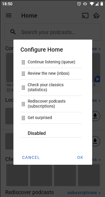
What was updated:

  • Continue listening now has more episodes, to not be just a replication of the miniplayer while still providing access to the queue (if the queue is empty, something should be shown in the two empty spots nudging the user to use the queue - will work on that).
  • Add extra criterium to Rediscover screen (not recently played)
  • Section with most-listened podcasts follows statistics setting
  • Minor text changes (e.g. ‘episodes’ > ‘inbox’)
    • I changed ‘Look at the latest’ to ‘Review the new’, but actually not a fan of it, because you can’t take action there. So I would change it back.
  • Added screen/fragment for changing the layout (allowing the user to change the order and hide sections)

To be done/discussed:

  • Not sure if the local search screen would need/benefit from a mock-up? I mean: we have local search already.
  • Discussion about the section titles: @ByteHamster said the ‘Continue’ section would be too long in German, @Matth78 suggested to rename ‘Check your classics’ to ‘Most played podcasts’. I wanted to keep a consistent pattern between all titles, but that may be difficult. Maybe a mix may be easiest & nicest after all:
    • verb + what
      Continue listening, Look at the latest, Check your classics, Rediscover podcasts, Get surprised
    • verb
      Continue, [something for latest], [something for classics], Rediscover, Surprise
    • description
      In your queue, New episodes, Most-listened, Forgotten podcasts, Random suggestions
    • a mix
      (Spotify does this: ‘Jump back in’, ‘Made for [name]’, ‘Recently played’, ‘Good morning’)
      Continue listening/Up next, New episodes, Most played, Rediscover, Surprise yourself

Ok, I thought there were two already. Discussion for another thread, then :slight_smile: I kept them in the mock-up because I like this new layout and was too lazy to ‘correct’ it (there’s a lot of details in these so it’s relatively much work).

1 Like

My suggestions for section titles :

  • look at the lastest : “Recent episodes” or “What’s new”
  • check your classics : either “Your top podcasts” or “Most played podcasts”. Classics sounds too serious, :wink:
  • rediscover podcasts, maybe : “Podcasts to catch up”

In your mockup there is one caveats for me : if it is a home screen I really feel it would be better to have all in one screen without need to scroll to see all sections. :worried:
I don’t see how to fit it all and keeping all sections. I would say my less favorite one is “get surprised”. Even without it, would all fit?
Another point about vertical space, there will be less than in your mockup if there is mini player, and potentially a bottom buttons toolbar (to potentially replace drawer menu)

I like it in English. Not sure (yet) how it’d translate into Dutch. So I guess you’re in favour of the ‘mixed’ approach (from my list above).

I see why you’d want that and you’re right about the limited vertical space, but I don’t think it would be possible to make everything fit. And even then: my boyfriend’s phone (and with him, many others) has a rather small screen. He’d still have to scroll, even if we’d make it fit on your screen :slight_smile: (well, depending on the size of your screen, but you get my point haha).

I don’t think we should compromise usability/elements on the page in order to make it all fit. E.g. Spotify’s home screen is scrollable, too, so it’s not uncommon.

If indeed the user could reorder & disable the sections (which would be cool but not sure if feasible), I would hope this already would make it as best for you as possible (you could hide for example the section with random episodes).
I first thought to always keep ‘search’, but maybe it should be possible to turn that on/off, too (allowing you to give more space).

2 posts were split to a new topic: Episodes screen proposal

Hi all,
I can get started on the implementation.

You currently already have 4 open PRs. I would suggest to get those finished and merged first before you start another one.

1 Like

Sure, i’ve updated several of them. I believe one of them can already be merged.#5097
And episode multi select is ready to be reviewed. Hopefully you have time later this week.

#5097 is not done. It always shows “network error”, even if it could also have other causes.

Sorry, I meant #5036 Hide keyboard when not searching by peakvalleytech · Pull Request #5036 · AntennaPod/AntennaPod · GitHub

That one currently has the fix commented out :wink: Please have a look at the comments there.

Ok. Will deal with that soon.

Started here [WIP] Home by ueen · Pull Request #5167 · AntennaPod/AntennaPod · GitHub
Please check if it’s going in the right direction (very early stage).

@ByteHamster code wise, do you think that’s a sensible approach (LinearLayout in ScrollView and then filled up with the section Views (RelativeLayout) with RecyclerViews that display the covers (scrollable horizontally).

For the EpisodesFragment on the home screen, I was thinking it could be optional (hidden by default) and is only displayed if the sections cover less than 50% of the homescreen height while I think there should be a requirement of at least one section that’s selected in the HomeScreenSettings :slight_smile:

(For now it includes my unified Episodes screen and the new Inbox to test if it can be integrated in the Home screen, I could separate them later if this is going forward)

I build the basic infrastructure and further views could subclass HomeSection and can be easily added in the HomeFragment, I might need some help with specific behavior (DB access) and implementing EventBus to update the recyclerview items in the Home screen sections as I’m not that familiar yet with the inner workings of AP, so I would be glad if someone more experienced could take over at some point :slight_smile:

Sorry, this I don’t understand. What does this mean? Are you doing something different from what is in the mockups?

This was a suggestion to include my paused episodes usecase Episodes screen proposal - #51 by ByteHamster take look there for the discussion and take a look at the apk in the PR above to see what I’m working on :slight_smile:

Sorry for the late reply.

I hope that it does not get too hard to separate them again. I would suggest to focus each PR on a single feature at a time.

I will have a look at the code in the next few days. Generally, a ScrollView could lead to inefficiency when there are many items because it keeps all of them in memory instead of recycling views that are out of view. Not sure if that would be a problem for us.

Uhm, yeah, the EventBus things in general could need a rework. Currently, most fragments catch like 5 different events and do the exactly same thing for all of them - which makes me wonder if we even need so many events. Not sure yet how to efficiently rework them, though.

I wonder if there would be a clean way to reuse code between the fragments and their home screen counterparts. Probably not easy to do it cleanly.

To be honest, I was mostly thinking of making the episodes a “normal” home screen section (but with a configurable number of episodes shown). I have not looked at the code yet but it looks like they are some kind of special case now.