It would be nice if the episode time box that displays where you’re at in the episode when you’re dragging the position could be moved up a bit so it’s easier to see. Ideally it would be above the “Shownotes” box. As it is it’s too close to your thumb when dragging. Hopefully that makes sense…
Hi @willied
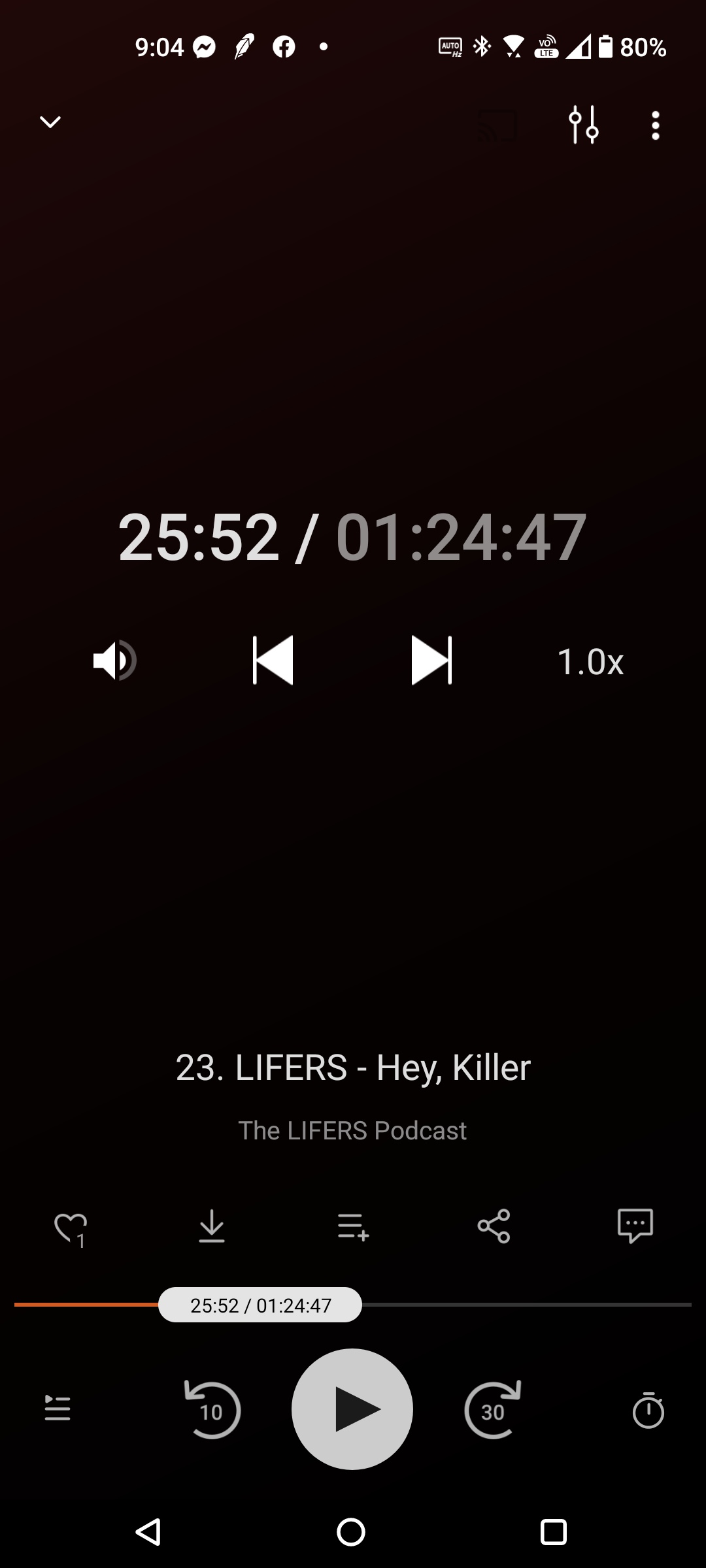
Thanks for chipping in on our forum! Actually in 2.4 the time is displayed above the timeline when ‘scrubbing’ (moving the time position). So it should already be easy to see the time of the position you’re setting the playback to. Don’t you have this too (see element I gave a blue circle, below)?
Yes, that’s where it is on mine, but when you’re scrubbing around the middle with your thumb it can be a bit obscured. And it would make more sense to me having it over a blank area instead of over the “Shownotes” box since the time is transparent.
I agree that the placement on top of the ‘shownotes’ button is a bit odd. But I agree with @ByteHamster that the time indication makes sense to be in close proximity to the slider. And in terms of size I find it a nice balance between the rather small indication on YouTube (though it is supported with the miniature image of course) and the quite massive Castbox approach.