# UI Suggestion: Moving episode duration to the metadata row
**URL:** https://forum.antennapod.org/t/ui-suggestion-moving-episode-duration-to-the-metadata-row/9113
**Category:** Uncategorized
**Created:** [September 1, 2026, 1:54pm UTC](https://forum.antennapod.org/t/ui-suggestion-moving-episode-duration-to-the-metadata-row/9113 "2026-09-01T13:54:58Z")
**Posts on this page:** 4
**Page:** 1
### Author:  [@Osman\_Koroglu](https://forum.antennapod.org/u/Osman_Koroglu)
#### Post date: [September 1, 2026, 1:54pm UTC](https://forum.antennapod.org/t/ui-suggestion-moving-episode-duration-to-the-metadata-row/9113/1 "2026-09-01T13:54:58Z")
Hi AntennaPod Design Team,
First, thank you for building such a fantastic, privacy-friendly open-source podcast app.
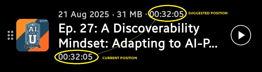
I am reaching out to propose a minor UI layout adjustment to improve the scannability of the episode list view. Currently, the episode duration is positioned below the podcast title, which separates it from the rest of the file details.
I suggest moving the episode duration to the top metadata line, right next to the podcast file size (e.g., “Date · Size · Duration”). Consolidating this information above the title would create a cleaner layout and keep all the core technical details grouped logically together.
I have attached a quick mockup image to illustrate the current layout versus this proposed change. I would love to hear your thoughts on whether this is something the team would consider.
Thanks for your time and continued dedication to the project!
Best regards,
---
### Author:  [@Matth78](https://forum.antennapod.org/u/Matth78)
#### Post date: [September 1, 2026, 4:28pm UTC](https://forum.antennapod.org/t/ui-suggestion-moving-episode-duration-to-the-metadata-row/9113/2 "2026-09-01T16:28:34Z")
IMHO it’s more logical as it is. When already started to play it’s replaced with a bar to show current position :

---
### Author:  [@Cache\_and\_stash](https://forum.antennapod.org/u/Cache_and_stash)
#### Post date: [September 1, 2026, 10:34pm UTC](https://forum.antennapod.org/t/ui-suggestion-moving-episode-duration-to-the-metadata-row/9113/3 "2026-09-01T22:34:16Z")
I’d like the option to not see duration or filesize. During recording, podcasts hosts have no idea, down to the minite and especially not the single digit second of exactly how long episode will be–so why spoil it?
---
### Author:  [@Osman\_Koroglu](https://forum.antennapod.org/u/Osman_Koroglu)
#### Post date: [September 29, 2026, 1:41pm UTC](https://forum.antennapod.org/t/ui-suggestion-moving-episode-duration-to-the-metadata-row/9113/4 "2026-09-29T13:41:13Z")
Hi everyone 🙂 ,
Thanks for the quick feedback! I wanted to clarify how this change helps with the spacing and how it could actually address the points raised by Matth78 and Cache\_and\_stash.
Right now, deciding whether to listen to an episode often comes down to a quick check of its size and duration. Splitting these details up—putting size at the top and duration at the bottom—forces the eye to jump back and forth across the title just to get the basic facts.
Grouping them into one line ( **Date · Size · Duration** ) fixes a few things:
- **More breathing room:** Keeping all the text on the top line leaves the area below the title completely clear. This adds natural spacing between episodes, making the list look less crowded and much easier to scroll through.
- **Handling the progress bar (Replying to @Matth78):** You make a good point about the progress bar replacing the duration. If the duration moves to the top, the progress bar could either live there seamlessly (e.g., changing to “45m left”) or stay on the bottom line without shifting the layout around when an episode starts playing.
- **Hiding metadata (Replying to @Cache_and_stash):** If you prefer a clean look without duration or file sizes, putting them on a single line actually makes it much simpler to program an optional “Show/Hide metadata” toggle in the settings later on, since it’s just one line of text to turn on or off.
Putting these details on one line gives users a quick, single anchor point to check if an episode fits their current time or data limit, while giving the overall list a much cleaner look.
Let me know what you think!