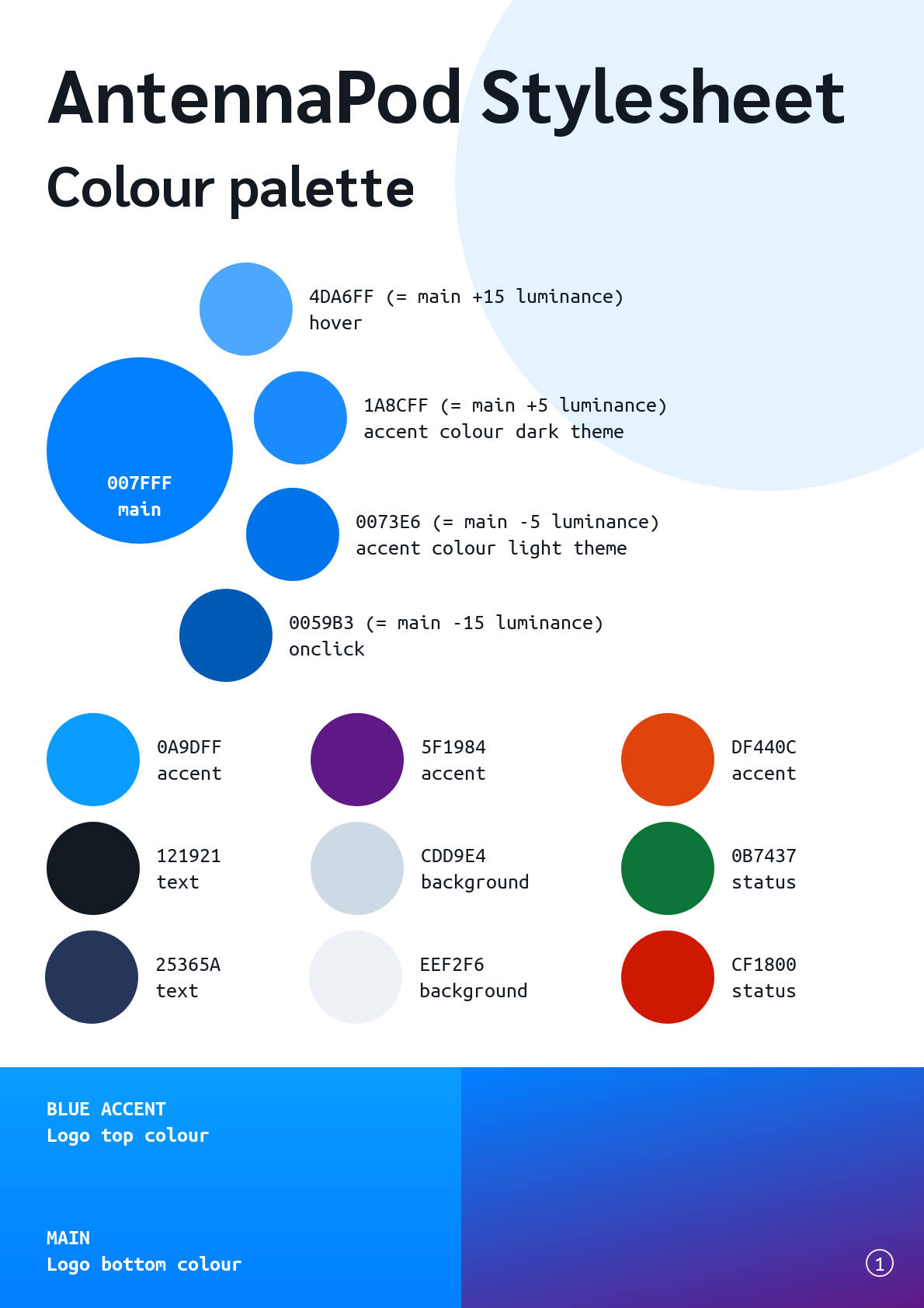
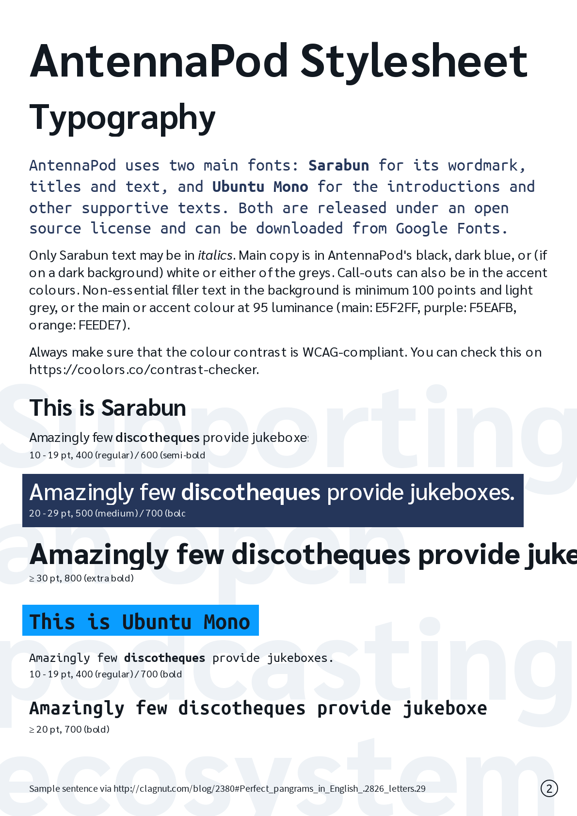
It annoyed me that we didn’t have a proper colour overview with hex codes. So I started working on a stylesheet the past week. As I had a few days off, it got a bit out of hand, so now I have the following
It’s just my own creativity, derived from the logo. So if anyone has any comments on the colours, secondary font, etc, please do share it. It should be a living document.
Particularly I propose to change the accent colours in the app to make them more in line with the brand colour, @ByteHamster. I’ve checked them for WCAG compliance, and these are the results:
As for onClick in material design there’s the ripple effect and that’s usually a white/black color with transparency so maybe you could just calculate that, then it could be used independent of the primary color
In the one picture with the wordmark the logos seem to be different, is this intended?
Also really like the blue violet gradient, maybe it could even become a new logo background or something, have the feeling that sort of gradient is really popular nowadays
I’m a bit confused about the gray letters within the word mark. The different word marks also use different variants of the icon - I think we should be consistent there.
Hmm. Users are more used to the app than to the official brand color. Changing the app will be more noticeable to them than just specifying another brand color.
The accent color we use in the dark theme is #3D8BFF, not #1a8cff, which results in a 4.56 (good) contrast
I don’t think we use blue text on elevated backgrounds.
Old AntennaPod versions had the problem that they used tons of different shades of blue. Not sure if we should really specify more than the two main ones. The gradient that is displayed on the main screen currently is #0ba2ff to #0878ff. I think that’s more contrast than the one you show here. What is the purple gradient for?