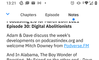
I don’t like 'em because they take vertical space, don’t look clean (ok, taste is subjective) and limit swiping options (cf inbox discussion).
By accepting the thing you don’t like: tabs ![]()
To be honest I never use the Play store that extensively that I ever had a look at their tabs. But maybe you’re right. Swiping doesn’t equal changing tabs (which is the major annoyance I have with the current Episodes screen). And also they take up less vertical space. Same for the tabs in Breez (which puts them in the top bar, which also saves a lot of space):
