For me it would be OK to move the tabs/filters to the bottom. @Matth78 has a valid concern, though:
Also, the relying on icons only should be done with caution, warns Google in its Material Design Guidelines:
For me it would be OK to move the tabs/filters to the bottom. @Matth78 has a valid concern, though:
Also, the relying on icons only should be done with caution, warns Google in its Material Design Guidelines:
With tabs you can’t have swipe actions.
IMHO filters are more easy to understand instead of multiple near identical tabs where its hard to even see the difference (at least for me).
Of course the icons should be chosen wisely (current ones are just placeholders), but as you know, a icon says more than a thousand words.
Also just using the filters quickly shows you what they do, especially for new users the empty description will provide useful information (like “No favorites - select an episode with a long tap and mark it as a favorite”).
@Matth78 the current Filter Dialog available in the toolbar is kept of course, so you can still filter. Would encourage you to just try the PR, the quickfilters do provide a very nice way to use the Episodes screen, especially with one hand ![]()
It just happens I tried this morning!
I felt it would be better to have filter accessible from top bar and not inside 3 dots menu. Yet I know it probably be vetoed because there is already 2 buttons.
About quick access with bottom icons what I feel not good is that it’s hovering above episodes and that make it harder to notice. I don’t mean it shouldn’t be, it’s just my reaction.
Being said why not using tab bar and instead of having tabs having your icons to filter?
All in all I don’t mind too much as long it can be quickly filtered (with one tap) to show only new episodes and be able to quickly switch between all / new / favorites.
When trying to filter with your bottom bar it didn’t work. I am not sure if I correctly interpreted icon meaning. :-/
What I am not keen on is having both an episodes entry and an inbox one. I know @keunes will rant ![]() but right now I still don’t see inbox as anything else than episodes screen filtered.
but right now I still don’t see inbox as anything else than episodes screen filtered.
So tabs are really hard to reach with one hand and to use tabs to filter (not to have different screens/pages) is breaking this design pattern, which will really be confusing people.
I think floating actions are familiar from the action button and I doubt that the quickfilters will be unnoticed long (that’s ok though, it does take some time for a new user to learn all the features in an app).
I think making inbox separate does make a lot of sense because it is a different workflow than Episodes screen and especially with the title “Inbox” I believe it will be a lot easier to understand what it is. (Also separate screens can be hidden in the settings 
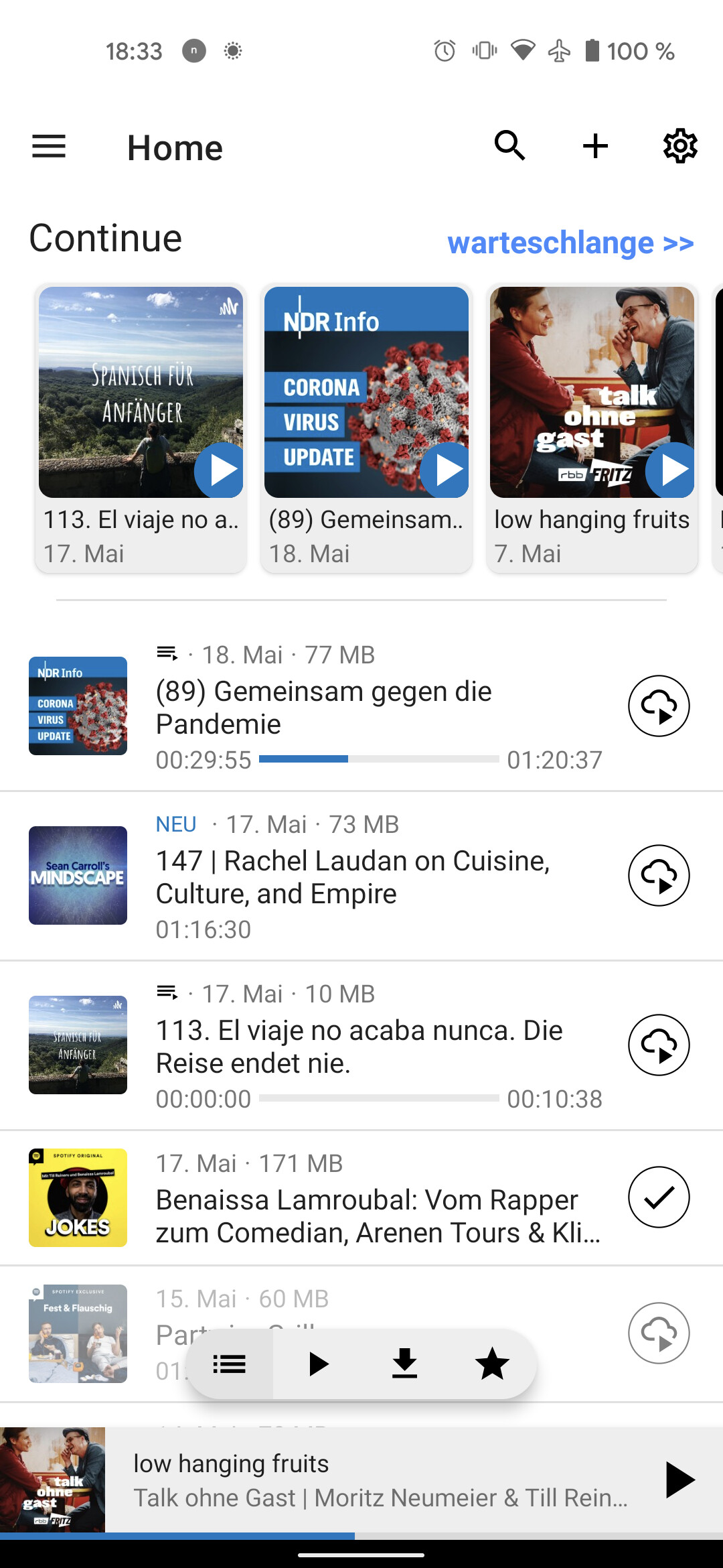
The quickfilters are: all / just unplayed / downloaded / favorites
So that should work, there are a few bugs with swiping that would need to be fixed, if this is to move forward.
Which is why I wanted a separate Inbox screen, to which ByteHamster now agreed ![]()
The saying is about pictures, not abstract symbols ![]()
![]() I agree that an extra screen feels a bit superfluous. But the fundamental problem is that tabs don’t combine with swipe actions, as @ueen already noticed. So either we get rid of tabs (having the floating buttons in the bottom, or don’t have tab swiping), or it’s an extra screen (which you could disable btw).
I agree that an extra screen feels a bit superfluous. But the fundamental problem is that tabs don’t combine with swipe actions, as @ueen already noticed. So either we get rid of tabs (having the floating buttons in the bottom, or don’t have tab swiping), or it’s an extra screen (which you could disable btw).
Can we make them more visible somehow, @ueen?
We could add some color or a border or something, but I’m not sure that it is really that hard to notice, as I said, it’s ok not to get all features right away and discover them step by step, it still serves its purpose, showing all episodes.
Sorry for the late reply. I am currently rather busy and have trouble keeping up with the recent large number of design change suggestions. I tried out your PR and I must say I’m still not happy with this whole thing. I hope that the following thoughts don’t sound too harsh.
I hope we can think about the BottomNavigation, i think it absolutly makes no sense with the bottomsheet (never saw bottomsheet+bottomnavigation) Also there are to many screens, plus the podcast list is quite helpful.
Tbh it’s not that hard with gesture control (Android11+), you just have to pull a little bit longer/slower than you would for going back, or you use the hamburger menu.
As for the pausedOnTop: it’s optional, and you can change/deactivated swipe action, so the current behavior is what I use, but that’s not necessarily the default, or what everybody has to use.
Let me argue little bit why I think the current behavior is good and different than queue anyway:
This way is more a pick and choose approach, I never have more than 2-3 paused podcasts, if I do get tired of one I can swipe it away, that will move it back from the top to it’s chronological order, or (second filter: only unplayed) remove it from the list! This makes sense because I did play it I just done want to finish it (No need to introduce another state).
Other than that, I always have a chronological list that basically never gets empty.
I get what you’re saying though, I could make my workflow somehow work with inbox/queue, but I don’t want to switch screens and queue just feels strange to me (at least for now) but that’s ok isn’t it? There could be different ways to use the app and basically this PR only simplifies the EpisodesFragment, and adds more optional/customisable functionality, so I don’t really see the downside, it just offers a better UI/UX and choice, you don’t have to use it or can use it differently 
Other swipe actions can be download or add to favorites or and so on, and you choose the one you use the most (or you deactivate it if you don’t want it).
The same applies to the queue. Episodes are removed when you finish them, so if you don’t enable auto-download, it only contains the paused ones. I don’t really want to add two different implementations of the same use-case.
paused ones in queue
Yea but that’s another screen I have to go to, that’s:
(1) slide sidebar open, (2) select queue, (3) scroll down, (4) start episode instead of
app starts with episodes screen (1) select paused episode on top…
…or select new episode or old episode that’s in Episodes but not in Queue, so my workflow requires less taps/gestures, and less screens.
But I’m more than happy to disable pausedOnTop by default and 98% of users will never even notice/use it.
Other than that I think one list and filter approach is better to understand and it enables swipe actions (which you can disable if you want - I think best would be a choice presented at first swipe, of course you could use episodes without ever swiping).
In general I don’t get the strong opposition to different workflows, in the end I’m happy with just using my episodes screen myself, but I suspect that this would be an improvement and will benefit others as well, especially new users.
So I think I offered all the arguments I have, just let me know if you want the customisable swipeactions dialog and I’ll be happy to work on the PR again ![]()
Then we should improve that instead of inventing a second way to manage paused episodes.
If I understood you correctly, you want to have a list of started episodes on the same screen as the list of all episodes. I think it might be possible to do something like this on the “home” screen. We could maybe add a setting that changes how many episodes it shows in each section. Then you can move the queue section to the top of the “home” screen, add an “episodes” section and disable all others. Conceptually, this can then be used exactly the same way as your pausedOnTop setting (but with the benefit that you don’t have to mark partially played episodes as fully played when you are not interested in them).
HomeScreen
Interesting, that could work! (Then the paused/continue section would need to be scrollable horizontally)
…thinking about it a little bit more, I think queue and paused are a little bit different use case after all, because the queue, as a playlist, could contain episodes that aren’t started yet, while paused ones are only ones with playbackPosition > 0 - so maybe the mark as played could be changed to reset playbackPosition also)
Anyway, for the Episodes fragment/section I would still prefer the quickfilters then, that would also remove the separate downloads screen (the logs have to be moved into the settings or smth then).
And I think the swipe actions are really valuable, I added toggle favorite and download as an option ![]()
It could, but only if you use it this way. By default, only started episodes are added to the queue. If you don’t enable auto-download and don’t add episodes to the queue manually, both lists are the same. That’s what I meant with inventing the same feature twice ![]()
Yea, but then i cant use the queue anymore, thats why i was saying it might be different after all.
Because maybe i want a queue for a long car drive and collect episodes for that, while i still want a paused section for the daily workflow, you know what i mean?
@ueen maybe what you truly need is a long standing features : ability to have multiple queues? What you describe for me is somewhat a way to have 2 queues.
If AntennaPod had this feature you could have main queue used like ByteHamster described and have other queues for your others needs.
Sadly I think it’s something not as easy as it sounds to implement especially as it would requires to adapt UI. (With potentially a lot of opinions…) 
Actually i dont want to use the queue  i just want the paused episodes on top of the episodes list, but @ByteHamster is trying to convince me, that that is what the queue should do…i’m not so sure afterall.
Looks good, i think i could live with that
(Queue sorted by latest paused and then rest of queue)
Also I think the Home screen is a great soft introduction to the queue, you can use it without knowing it and discover the functionality step by step, so I’m quite happy with this idea actually.
Let me know what you think
@ByteHamster I read in the thread about the home screen you want to make downloads easier to find, I think that is well served with the unified episodes and I was thinking maybe there could be a an info for new users if they surpass like 1GB of downloads or something (similar to the stream/download pop-up - if you start a new download and the stored downloads are above 1GB this redirects to downloads screen or episodes filtered for downloads)