Workflow=userstory, however gotlike to call it, there are different ones.
I’m only subscribed to podcast I want to listen to, so I mainly use the EpisodesScreen to check if there are new ones and then listen to them, rarely I go to a podcast feed via the sidebar to listen to older episodes. That’s basically, easy and straightforward that’s why I was confused by the sidebar at first, because there are so many items, to me the only ones necessary are discovery, to add new podcasts, and then the combined feed of all subscriptions.
Also I think this is somewhat a regular user expects, similar to the subscription feed in YouTube.
I get the new/queue workflow, but its certainly not for everyone, and the way it is now, it’s almost impossible to discover.
So this proposal only makes when an inbox is introduced seperatly, because it breaks the new/queue workflow.
I’m not sure how the homescreen fits in, let’s take your first userstory, to restart playback, you can just use the bottomsheetplayer, with the inbox you fill the queue, done, no need for a homescreen.
I don’t where your stand, but do you want to provide choice to use AP as one wants or make a unified UX that makes sense to everyone? Because right know it feels it’s somewhat in between. I guess I only feel strongly about not making inbox/queue the default, as I feel it is kind of a niche workflow/userstory and hard to discover, but currently it’s equally hard to discover how the Episodes screen works with all the tabs (and I found that Episodes is the subscriptions feed only by trial and error)…
Sure. My point was that in any case screens (what you listed) is different from those stories.
Thanks for writing up your story. The first bit isn’t relevant - all users are only subscribed to the podcasts they want to listen to. It would be weird to subscribe to one that you don’t want to listen to To how many podcasts are you subscribed?
Let me rewrite and expand a bit: 3 I am subscribed to 10 or so podcasts. I always work from the Inbox screen: from there I check if there are new Episodes and then listen to them (I tap on an episode and start playback from the Episode screen). The occasional episode I’m not interested in, I swipe away to Ignore. I’m not interested in older episodes, so I rarely I go to a Podcast screen via the sidebar. If I was listing to a podcast, I can relaunch playback through the miniplayer. If I pause episode A and start playback episode B this means I’m done listening to episode A (I won’t finish it) - so I don’t care about a list of paused/previously started episodes. The Home screen I don’t use either, because I can start playback via the Episodes screen, and don’t find the other elements on the Home screen helpful.
Do you feel this could represent you?
It’s tricky to define a ‘regular user’ and to say what they might or might not expect. I feel like a regular user - I don’t feel special We have a lot of users that get AntennaPod through F-Droid, and they would probably have a different user profile than our Google users. So let’s not speculate to much.
The Inbox screen as I proposed it could work for you, but (as I wrote in user story 1) it also helps me. So it doesn’t ‘break’ a workflow that heavily relies on the queue.
In user story 1 I still benefit from the home screen, as it gives me access to the different screens I use (as noted, I sometimes want to see what I have on my device and choose a particular episode). In a way it replaces the sidebar menu.
I agree it’s ‘in between’ use-cases/workflows. And as there are different ones, and we cannot dictate the default (because we don’t know our users), a Welcome screen/interactive onboarding would help a lot.
Maybe i needed to be more clear, i’m only subscribed to podcasts i want to listen to every episode
On YT for example i dont see all videos and pick and choose the ones i want to see (like you with your inbox workflow) - subscribed to a good dozen.
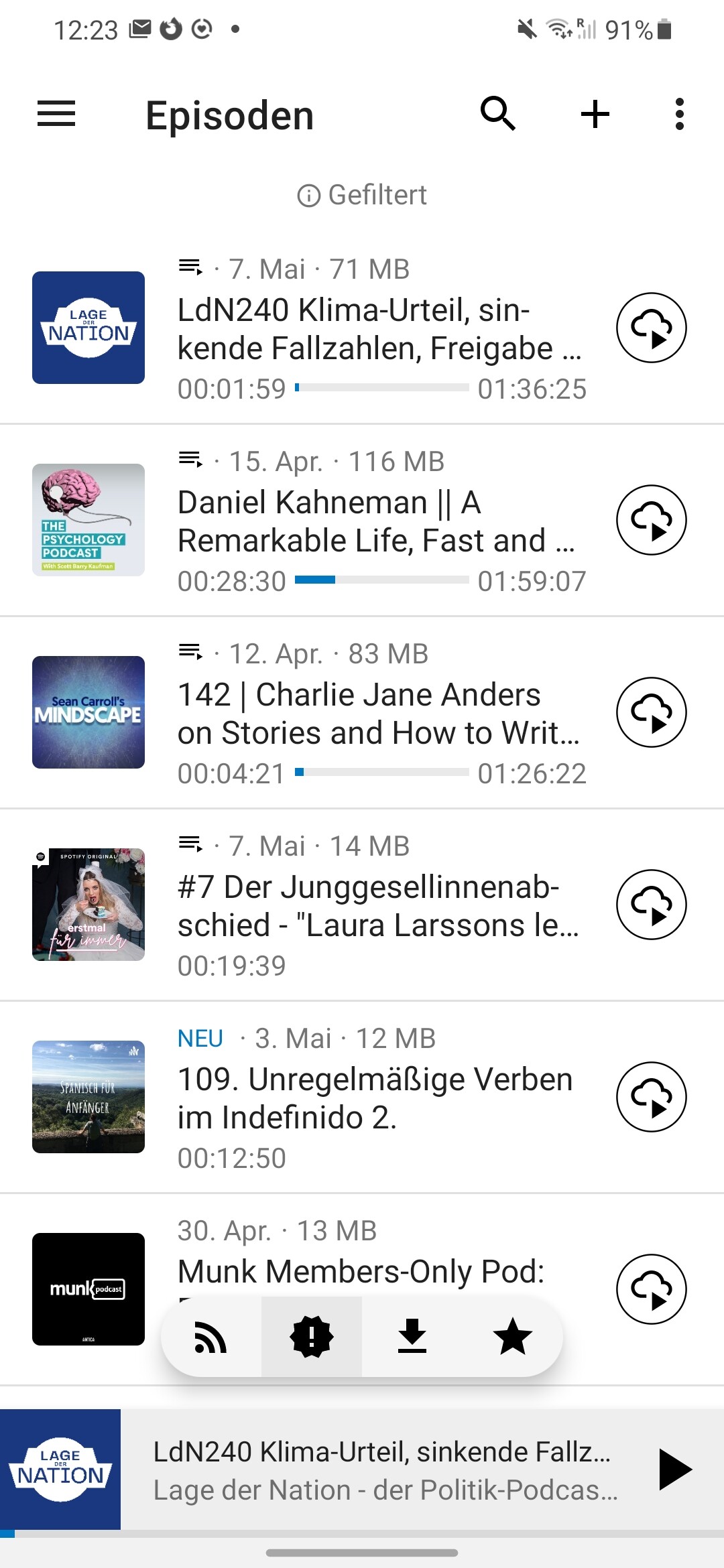
Almost, i do sometimes switch between episodes and continue one laters, thats why, in my new episodesscreen, the paused ones are always displayed on top, see:
i get that, but there is a regular user, and that is one that does not set any settings and in my opinion just wants a simple feed of all subscriptions, at least i think that is the expectation, you know, its the same on youtubes subscription feed or for that matter your e-mail app, theres just one feed where new episodes come in.
Depends there could be a default and you can change it or you force a choice in the beginning in the onboarding, but as i understood @ByteHamster and makes sense for me here too, the app should just work without a tutorial, so i think there should be a good default (this episodes screen ) and then there could be a popup (like the one “You stream a lot, want to stream by default”) where the user can customize as he goes.
I’m not sure, do you think inbox and my episodes screen could be combined?
Customizable swipe actions would be easy, maybe on the first swipe the tutorial/settings could come up like “what do you want to happen”?
Would you keep the paused episodes ontop or would that break the inbox? (could be made optional if inbox workflow was selected before)
also does the inbox need to be empty at some point or dont you mind if there are a few old episodes lingering in there? (saw the clear inbox from your proposal)
This might just work, then we could have both
Also i think the tutorial/settings on first swipe would provide a great opportunity to indroduce the queue to new users, really start to like this idea, maybe we could get some more feedback from different users
Sounds like quite a change, but i think this could be a huge improvement!
To add to workflow from users : in my case I have about 30 subscriptions. I use new episodes to see which podcast has released new episode. For episodes I want to listen I initiate a download to add them to my queue. For others one I either keep them as new for later (but it’s not often I do that, only if my queue has really a lot of episodes) or dismiss them. If later on I catch up for some podcasts I check their episodes and download the next one I didn’t listen to.
Edit : so in my workflow, queue is really important since I manage it and often reorder it.
Sorry, that’s not what I meant. I suggested to rename the “new” page to “Inbox” and move it to the sidebar instead of the tab on the episodes screen. When it then is its own screen, we can think about swipe actions.
+1
We already discussed something like this elsewhere. I don’t think it’s a good idea because when starting the app for the first time, users don’t know their preferred workflow yet. Anyway, this is another topic.
@Matth78 discovered it That’s also the exact same workflow I use
The home screen can help to guide users in how to use the app. If we order the elements similar to the queue workflow (which is how AntennaPod was originally designed to be used, I think), the users already get an idea on what to do when. They are still free to use other workflows, though.
Sounds like the queue with auto-download would be exactly your use-case. All newly released episodes are added to the bottom of the queue. When you don’t like one, you can swipe it away. You can even drag+drop them if you want to listen in another order. I don’t really understand what the advantage of your updated episodes screen would be over this. The queue is even more flexible.
Ahhhh, ok Now I get it, haha. Yes, makes sense. So there won’t be a ‘New’ tab in the Episodes screen. Just All, Favorites, On device. In this case, the Downloads screen would be dismantled: On device (previous Completed tab) would be under Episodes, Log would live under the Settings screen (possibly accessible also via a button in the On device tab, and of course via the notifications). Playback history I would tuck under the Queue and/or full Player screen.
Then we’d have:
Home
Inbox
Queue
Episodes
Subscriptions
Add Podcast (which can be replaced with updated Discover screen)
Main advantage is not to use the sidebar (one hand), also thats not really my workflow. I often dont even get to complete an episode in one go, so i always choose the episode i want to listen to based on the current mood, therefore i have really no use for the queue. But i get why one would want the queue if you are commuting a lot or something, i just think it isn’t the default expectation (see yt) and should be better explained
But its not just about my personal preference, its also about versatility for different use-cases, i think the one list and filter aproach is better because you dont need to switch screens so often.
And in the current version, its fully compatible with the inbox use case!
Maybe this video helps explain it a little bit better
The firstswipe would be a great opertunity to indroduce the inbox/queue pattern with a small infographic and give the user the choice to change the swipe actions to whatever they prefer.
But you could have all new episodes added to the queue automatically. Then from there you can play, pause and/or swipe away. It lists also your paused episodes. I think that was ByteHamster’s proposal for your use-case. That way you can keep your workflow, but with the existing screens. You just always use the queue, and don’t need to switch screens either.
I don’t agree (with the default expectation). AntennaPod is more like a music player where you listen a playlist. Besides default setting is to download not to stream. I also think all podcasts players use queue(s) but I might be wrong!
I have no problem with “all episodes” screen to be enhanced with filter and swipe but I don’t think it’s how most users manage their episodes.
When thinking about it the one thing lacking is ability to quickly switch to episodes screen from queue in one tap. And it would be perfect if there was a visual cue when there is new episodes.
In your case it would need to be customizable so you could choose to quickly go to all episodes (and not new). If it was maybe queue could also be more useful to you?
It is kind of a playlist. But if all episodes of all podcasts you’re subscribed to are added to it, you have what you need. I don’t see why you wouldn’t be able to scroll back and listen to an episode from last week? As long as you don’t swipe it away, it can still be there waiting for you.
I think of it less like a music player and more like a subscription feed like youtube - either way, i think, however great, the queue workflow shouldn’t be forced, the user should be able to learn und discover this functionality if he maybe uses AP like i do, and who knows, maybe some day i’ll use the queue, i’m just not there right know.
So i think removing tabs from Episodes and having the floating quickfilters at the bottom instead is a good idea, irrespective of the discussion above (enables customizable two directional swipe actions and is easier to use with one hand).
Actually having a seperate Inbox tab, might be a good idea to make it more distinct. I still would open a small infographic and a link to swipeactions settings on the very first swipe to introduce the queue workflow to help new users.
Is there a way you could agree to a modified episodes screen or do you absolutly want to keep the tabs?
I would offer to do the Inbox screen as well then (as i basically already have all the code for bidirectional swiping and so on).
I generally like it but I would not change so much at once. After just switching the new/history screen, we should probably wait at least half a year, so users can adapt to the change. Doing too many changes at once will probably lead to annoyed users. The list is missing the “playback history” screen, by the way.
We could say the same about the “subscription feed”/“episodes screen” workflow
So i think removing tabs from Episodes and having the floating quickfilters at the bottom instead is a good idea, irrespective of the discussion above (enables customizable two directional swipe actions and is easier to use with one hand).
Is there a way you could agree to a modified episodes screen or do you absolutly want to keep the tabs?
I would offer to do the Inbox screen as well then (as i basically already have all the code for bidirectional swiping and so on).
 that’s why I was confused by the sidebar at first, because there are so many items, to me the only ones necessary are discovery, to add new podcasts, and then the combined feed of all subscriptions.