App version: 2.7.1 (F-Droid)
Problem you may be having, or feature you want:
- Favorites Feature
- I presently use a “favorites” tag on my fav pods, but creating option for user to mark podcast Subscriptions as “favorites” would enable app-wide sorting & filter options. Would improve loading time for when user’s just checking favs for new eps, allows fav filter for stats, downloads, etc.
- Cover Art for Tags
- Cover art for tags/folders cover for improved discovery in Subscriptions menu.
- Download Menu & Nav Icons
-
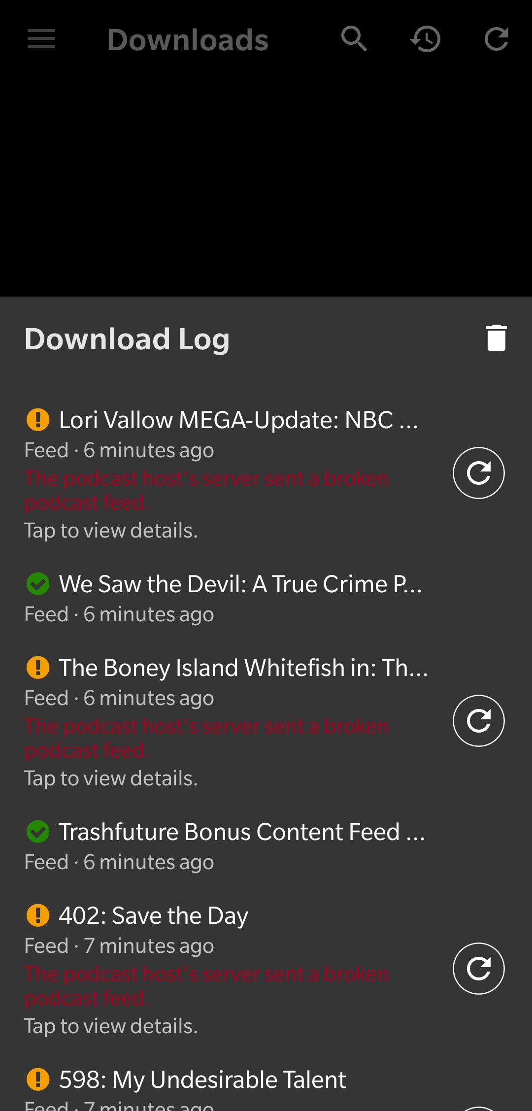
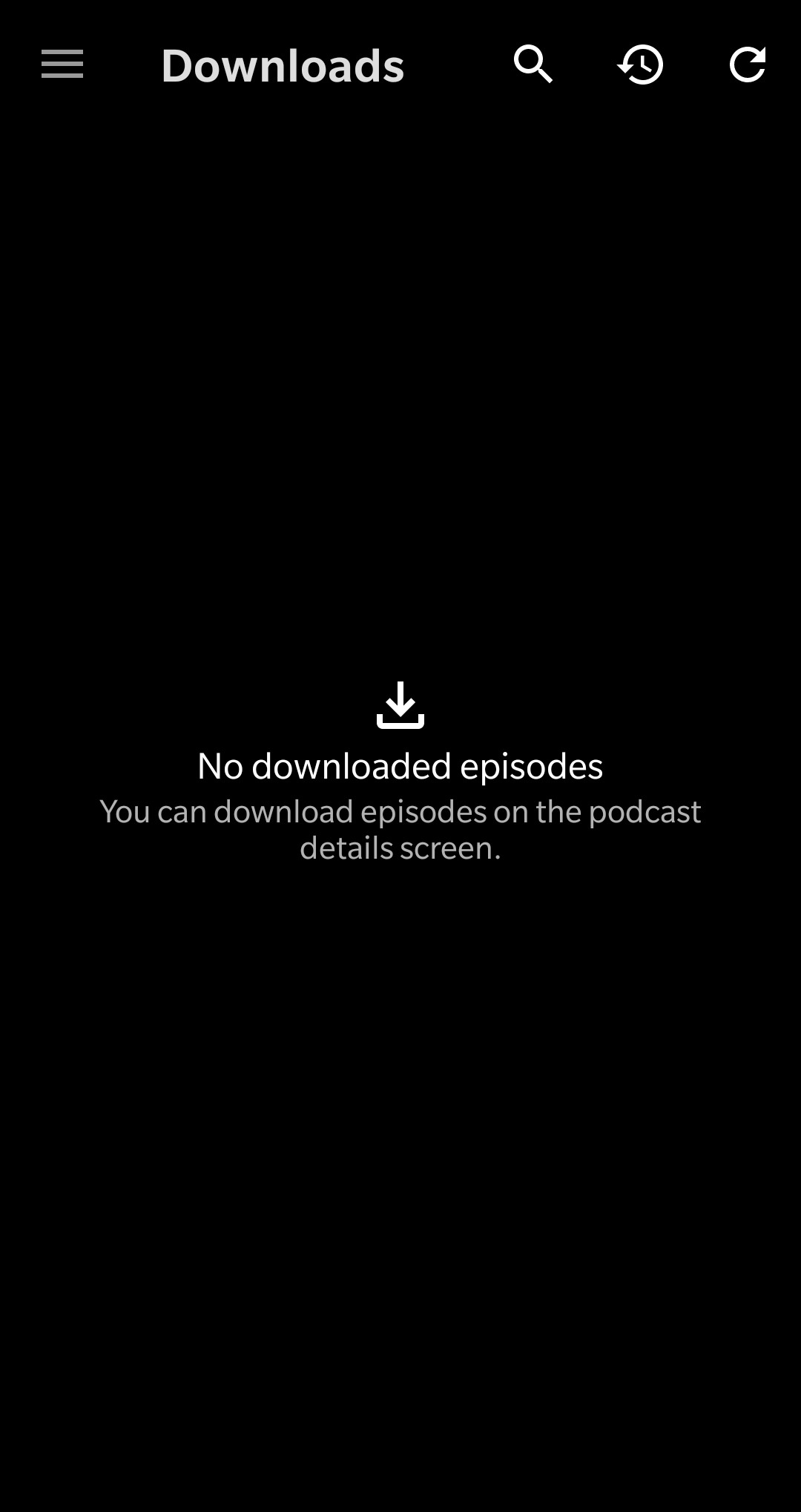
3a) Request to revert downloads tab back to full page log as default, with downloaded eps in menu tab (or vice-versa). New log bottom pop-up always requires expansion to full screen due to log length. I stream eps & only download to archive, so download menu sits empty & log view requires double loading time & 2 additional taps: menu > downloads > 1) log icon > 2) tap pop-up to expand.
-
3b) Log & refresh icons also look too similar next to each other, I still accidentally hit refresh.
-
Podcast Stats View
I personally love the statistics feature, but three issues are holding it back from reaching it’s full utility & being appreciated more:
-
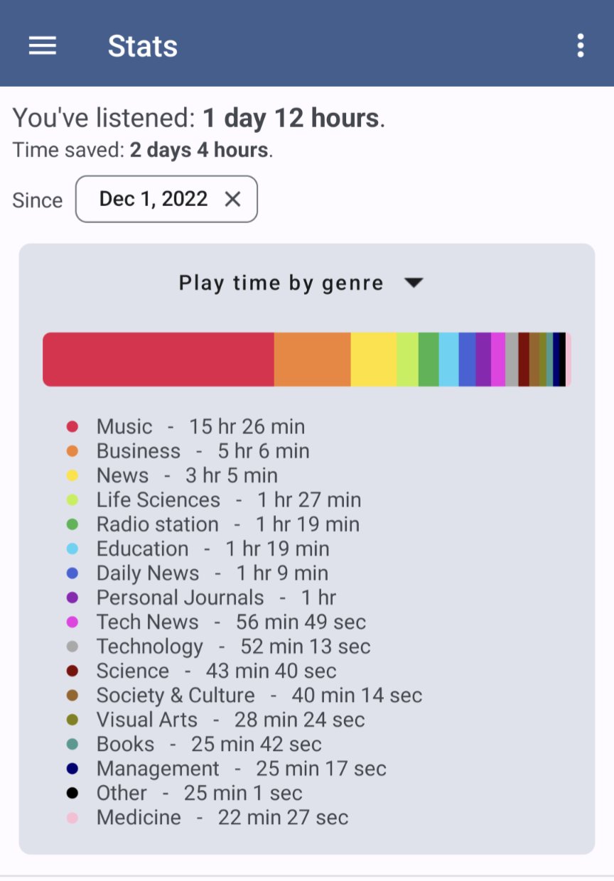
4a) Loss of color coded podcasts/chart due to current threshold set to rank based on individual pod playtime relative to total playtime app-wide. This causes all podcasts to turn gray when no podcast can match or go higher than combined listen time of all other pods. (see: image attached). For users with hundreds of subscriptions, all podcasts become gray in stats view no matter how differential listening time is (i.e. Pod with 100hrs is same color as pod with 0.1hrs: gray), since no podcast has majority relative to the hundreds of podcasts with any play time.
-
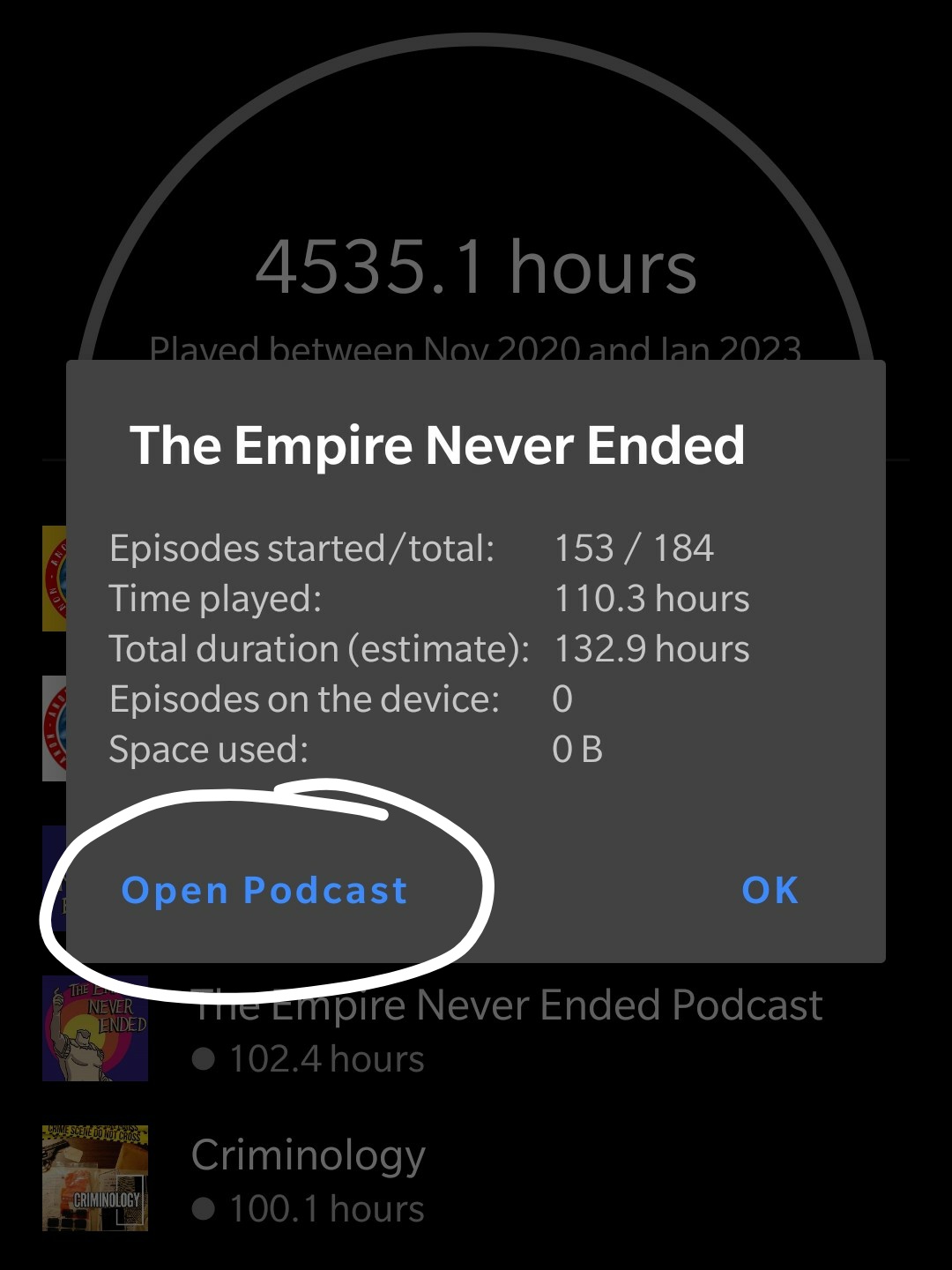
4b) In stats detail pop-up (shown after clicking podcast title in stats list), either move “open podcast” text button away from “close” so it’s not visually overlooked (tapping outside bounds closing pop-up + royal blue text in dark mode caused me to miss this feature until I was about to request it) & not hidden until stats fully load; OR create option for user to select either “view detailed stats” or “open podcast” when tapping podcast title in stats list.
-
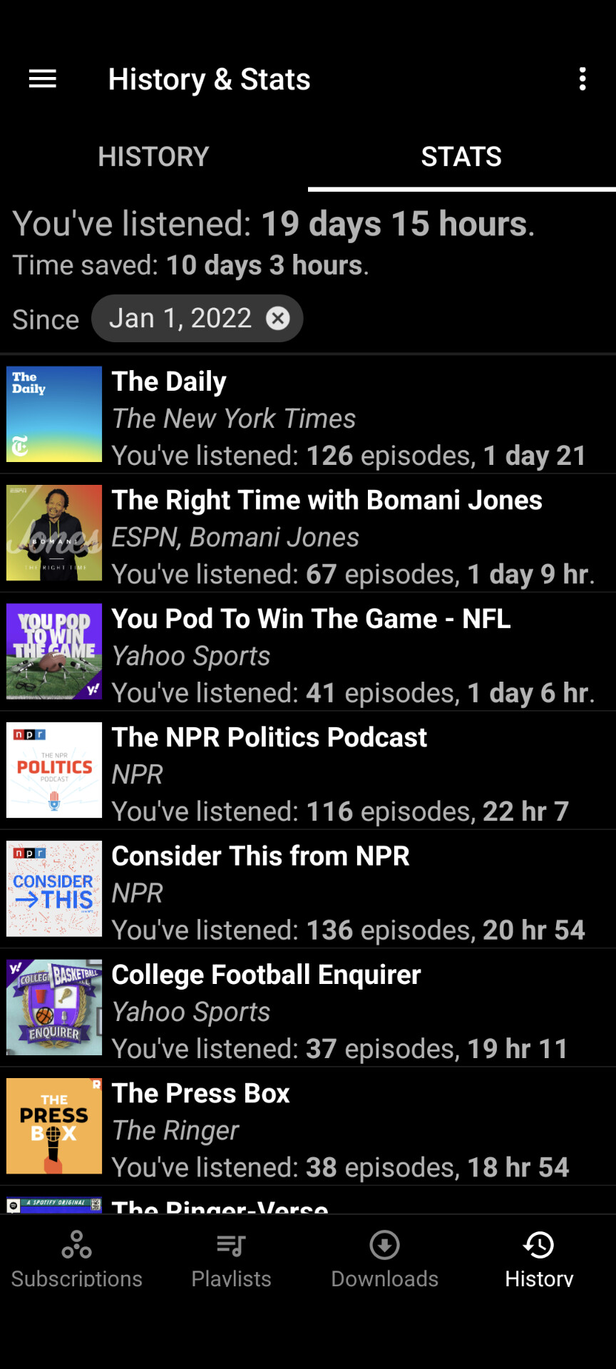
4c) Make stats menu more accessible again. It’s too many clicks & very slow loading to nested in subscriptions page (page I never use). Lots of people really like stats feature, but new placement isn’t intuitive & difficult to find. If I hadn’t read changelog before updating, I would’ve never located stats menu on my own. I liked the ease of selecting stats from bottom of side nav menu, but making it a separate menu option would be really helpful.
-
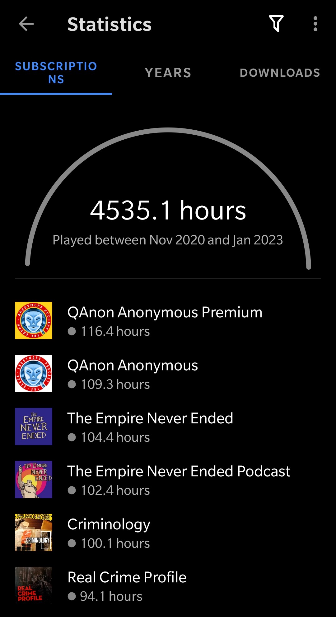
4d) Consider removing “Download” tab in stats menu: it causes “Subscriptions” text to reflow (at least on my OnePlus 6T screen) & IMO lacks utility in stats menu since downloads have their own menu. (see: Image attached).
-
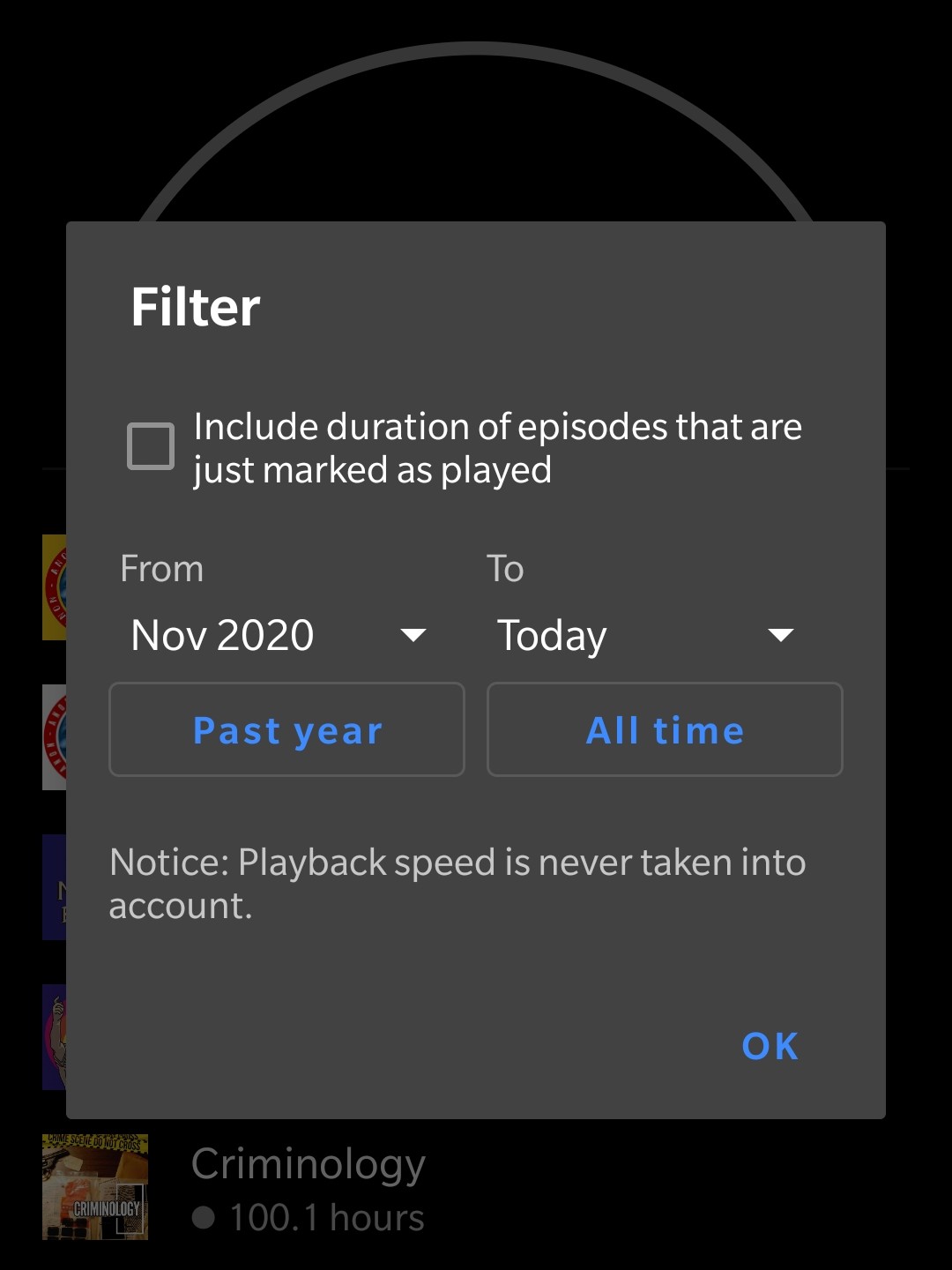
4e) Add more granular filter options in stats other than date range, and a few sorting options. Primarily requesting alphabetical sort option.
Suggested Solutions:
- Cover Art Options:
- Default to cover art of first podcast (or most played — whichever’s easier) in tag list
- Default collage of first 4 pod covers (see: Spotify & Apple Music generated playlist covers),
- User image upload (+ crop and/or manual img centering tool)
- Download Log & Refresh Icons
-
3b) I design widgets so I’m very familiar with icon packs & libraries. Looks like you’re using Google material icons (aka material design icons: MDI). Here are some MDI options to try:
- Refresh icon:
- round-sync material icon (circle with 2 arrows, clockwise)
- Download log icon: Instead of MDI “history” icon try one of these:
- clipboard-text-history (clipboard list + clock)
- weather history (cloud + clock → looks like cloud database)
- overview-outline-rounded (text note + clock)
- Refresh icon:
- Podcast Stats View
-
4a) Continue ranking top podcasts based on listening hours, but if played subscription count reaches a certain threshold, switch stats color assignment calculation to a limit of only the top 30 most played podcasts (or to whatever quantity fits & looks best in visual diagram), so non-ranking podcasts remain gray & in stats list, but no longer take up space in crescent chart. Calculating 100% based on the sum hours of the top 20-30 most played pods, instead of from total podcast playtime, will eliminate the gray problem.
-
4b) Add small icons or touch zones next to podcast title (aligned to the right so they’re uniform, character limit titles if needed for space) to either open podcast and/or display detailed stats stats pop-up, OR add intial pop-up menu promoting user to select between open podcast or view detailed stats, OR keep pop-up as-is but add open podcast button/icon next to header.
-
4c) One or more of the following:
- Add stats menu view option (i.e. settings view checkbox option to add stats to side nav)
- Revert stats page back to original menu position
- Move stats menu icon to the “add podcast” menu (maybe to the right of search bar). Page is much faster loading, more frequently used that subs, & more intuitive to group with page showing trending pods.
-
4e) Other filter & sorting deas:
- Filters: under/over set number of played hours (drop-down to select fixed max/min number and/or number range, OR user input field), filter out podcasts <1 hour, isolate played or unplayed pods, filter favorites (if fav pod feature added), etc.
- Sort by: alphabetical, most/least played, most/least no. of episodes played/started, date added, etc
Screenshots / Drawings / Technical details:
gray stats & “subscriptions” text wrapping:
open podcast button visibility:
current stats filter menu to implement sorting/more filter options:
empty downloads page & icon confusion, under current redesign:
download log pop-up always requiring expansion example: