Home screen proposal

Well I’m basing it on the mockups, I thought that goes without saying, just take a look at the apk (of course it’s not finished yet) :slight_smile:

I think the PR is pretty far already, a few TODOs remain, but i think its already quite useable - check it out!

Try the debug apk

everything else should be according to mockups, only this small improvements:
- extended section rows to scroll horizontally and show a few more items
- the Continue section displays paused episodes from the queue first (and last played first), but the order of the queue, if an episodes is started, is respected.
- the setting features checkboxes to hide the sections and a reset option
- added add podcast icon to the toolbar
- added navigation to episodes screen to the “get suprised” section
- added shuffle button to “get suprised” section

?? Search is currently in the toolbar, should it be always in the toolbar or should I add a separate view like on the Discovery page?
I was thinking the user is used to search from the toolbar to search local and to not be confused with the new podcasts search online (Discovery) it might be sensible to leave the search in the toolbar on the home screen as well…what do you think?

?? Also should the “get surpised” be limited to episodes 2y or newer, bc sometimes i get some from over 10y ago? :confused:

SwipeActions work pretty great now and are available in Inbox, Episodes, PodcastFeeds and can be customized for each screen via a toolbar dialog. Also on the first swipe the dialog opens with a default suggestion so nothing unexpected happens. Should there be an settings option to completly disable swipe actions? Or wait until somebody actually has a “usecase” not to use SwipeActions? :smiley:

https://photos.app.goo.gl/4749ELRBq5bVMqSc9
Here’s a quick demo with three possible workflows
(Default, inbox/queue, continue/episodes)
I think this opens up really cool customizability on one screen :heart_eyes:

UPDATE: fixed a few issues and added swipe actions dialog

1 Like

Looks really nice :smiley::+1:

@everybody, are we sure about sections titles ? After viewing video :

  • review the news : sounds weird to me, should just be “new episodes”
  • get surprise : same, at minimum shouldn’t it be “be surprised” ? But It would probably better to just label it “Random unread” so it’s easier to understand what is listed ?

In fact I looked back at comments and I agree with myself! Quoting me :

My suggestions for section titles :

  • look at the lastest : “Recent episodes” or “What’s new”
  • check your classics : either “Your top podcasts” or “Most played podcasts”. Classics sounds too serious, :wink:
  • rediscover podcasts, maybe : “Podcasts to catch up”

I actually think the current titles are quite nice and understandable :slight_smile:

Did a few more bug fixes i think thats pretty much it*, please let me know if you find anything not working as expexted and UI/UX wise what do you think, maybe icons or colors needs to be refined (surley SwipeActions), so if you have any suggestions, feel free to offer them here :slight_smile:

*a bit of code cleanup needs to be done to fix the CI errors and i think a few unit tests broke as well

After close to one year after the last reply, we can revisit the home screen :slight_smile: I just had a bit of time and revived @ueen’s home screen PR. You can follow the progress here: Home Screen by ByteHamster · Pull Request #5864 · AntennaPod/AntennaPod · GitHub

This is how it currently looks (basically the same as @ueen’s work. My recent changes were under the hood only)

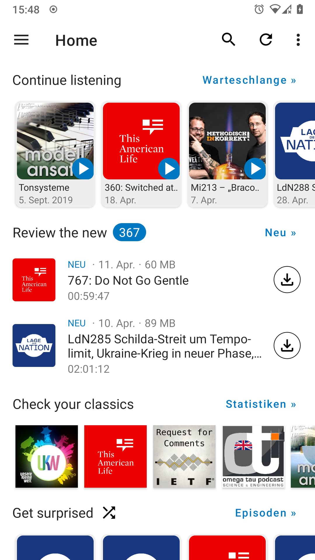
Now when using it for a bit while implementing, I am not sure I like the new way of showing the episodes. It does look more interesting than our existing lists but also has a few problems:

  • Font size of the title is very small (12dp). I think it’s the smallest text we have in the app and I don’t think that is good for accessibility. Making it larger makes it impossible to read most of the title.
  • The items are missing information like size, duration and playback position. This is especially interesting for the “Continue listening” part, where one probably wants to know how much is left.
  • The lists do not support the new swipe actions that we are currently introducing everywhere else.
  • It is a bit unclear what part of the cards should have what action. Currently, tapping anywhere on the whole card starts playback. Personally, I expected the card to open the episode details and only the play button to play. The play button is pretty small, though, so only the button might be hard to tap.

I think I would vote for using the basic episode lists like everywhere else in the app to avoid these problems.


Other thing I noticed: There now is a very prominent button to go to the statistics screen (next to “Check your classics”). I would rather expect that to link to the subscriptions screen because that’s a screen people use on a daily basis. The statistics are sometimes nice to look at, but not a regular thing that needs to be linked so prominently. Given that the statistics button is a lot more prominent in 2.6.0 already, I think it can be removed from the home screen.

1 Like

Awesome, it’s been a while but I’m glad we’re moving forward.

Just a few ideas, for the queue I think it makes sense to just have play on tap, I think you probably know what’s in there and want to continue listening (if not the still queue list is just one click away). Maybe a long click could open the episodes details page, to accommodate that use case.

Statistics I think can be fun, also for new users to discover, but it could be hidden (maybe by default) as well - as all sections can be moved or hidden on the settings button on the top right.

In general I’m sympathetic to your notion to have the episode list, I just want to share again my setup, where I have the episode list (kind of like a subscription box familiar from YouTube or classic RSS readers) which also allows the incredibly powerful SwipeActions, I basically never use any other screen at all, which is super handy.

One final thought, as intuitions and use cases differ, maybe we could consider offering different default configurations of the home screen on initial setup, I have in mind

  • a more spotify oriented version (kind of like the current proposed design, maybe even with a added discover section)
  • what I have, a somewhat rather traditional chronological subscription box (I found this to be the default expectation for some)
  • as a third I think we should release the home as a public alpha/beta and instruct users to customize and see what they come up with or even what’s still missing for them

I actually removed both the “half screen” thing and the custom sort order for now because it didn’t immediately work or had edge cases. When trying to implement each and every feature in a single PR, it becomes too much work to review and test everything. It’s better to have a home screen that is not as feature-packed than to have the PR stay open for yet another year. The rest can then be added incrementally – maybe even integrating user feedback already.

That already opens the context menu

Hmm half screen is difficult to do right, I can see that, but the custom order and show/hide menu was working quite well I think and I did a few revisions as well. I think (optional) customizing is the main point of a unified home screen - to fit different use cases&preferences, so maybe you can point to specific issues you identified so they can be fixed, otherwise I would highly encourage adding it back in. :confused:

My problem with the custom order was that I added a new screen and it did not show up at all (not even in the settings dialog) if one has already touched the order of the existing screens. I then changed the setting to work the other way around (like the nav drawer) – it now stores the sections that are hidden, not the sections that are shown. So show/hide is still there, just the sorting was removed (for now). It should still be possible to add it back at some point but I would rather try to get something ready to merge first before adding more extensive configuration.

Ah I see, but that should be easy to fix, just have an array/list of all sections, sort based on the preference and then all new added sections will be pushed to the bottom, no?

Yeah, it’s not a hard fix. It’s just one more thing to implement and to test. I was not 100% happy about the design of the settings screen as well and thought removing the setting for now would make it more likely that the home screen is ready to be merged in the near future. The shorter the PR, the easier to review/test :slight_smile:

Sure, but it’s also important to get the concept right so I’m not entirely opposed to let the PR stew a little longer and get a comprehensive design and implementation that’s well thought through, useful and customizable :slight_smile:

As a Tachiyomi user, I think it would be nice to have 2 line titles for the Continue Playing section, instead of a single one, as @ByteHamster says the font is small and some titles show a single word and stuff.

I believe something like what’s being done in Tachiyomi, showing the title inside of the cover art with a slightly darkened gradient to make the text easier to read.

Also, I think the way unread/new chapters are shown in tachiyomi is more modern than the current corner overlay.

I also like how the tab indicators don’t take over the whole tab space, but just the center portion. Of course this is not needed but more apps are using that approach lately, its Material You after all…

Hmm. I also miss the download state on these new horizontal episode lists. Like, you press the download button but have no indication of what is happening. The file size is not accessible at all, either.

I feel like that only solves one of the many issues this horizontal style has… :confused: My suggestion would be to simply use the normal episodes lists instead of this new design (even though it does look quite nice, it is is simply not as functional).

1 Like

I think this current style is nice as a default, also the episode lists are just one click away in the designated fragments if you click on the right blue button.

I’m not sure what use case you imagine @ByteHamster if you use the episode list a lot, than that could be solved with the bottom half implementation I had before and some sort of quickfilters, no?

An initial implementation of the home screen is now merged :tada: There is obviously still room for improvement – PRs and feedback welcome. The feature that would probably be most important as a next step is to add swipe actions to the home screen (they were available in the PR by @ueen but I removed them in order to keep the PR smaller/more manageable).

1 Like

I was recently forced to use an iPhone a while and checked out Overcast. I feel like theres a lot to learn in terms of homescreen and adding podcasts (following is optional) in general, i feel like @keunes already took some inspiration for the initial homescreen proposal maybe?

I‘ll Check it out more, maybe somone has access to an iPhone as well, i would love to go in that direction more than Bottom Navigation. The Overcast homescreen is rather cleverly desgined and highly customizable.

Let me know if you would consider this direction and i would love do some work in that direction :slight_smile:

Haha, no. Too much of an apple-antinfor that. But I take it as a compliment!

I took inspiration from the apps I had on my phone already, such as the public broadcaster, Spotify and Netflix. And my own thinking of what I would need. Others contributed ideas as well, here on the forum.

You seem to believe that bottom navigation and a good home screen are kinda alternatives, that we only need either. While I understand that with a good home screen bottom navigation is less needed, I still think we need to work on both.

Since we now have already the first (quite solid, if you ask me) version of the home screen implemented, feedback and further suggestions we maybe should cover in a separate thread. Please do create it (e.g. ‘Inspiration from the Overcast home screen’.) But would love to hear how you think it can be improved further in any case!

I foresaw some basic configuration of the homepage already (reordering and disabling blocks) but I believe that wasn’t implemented already. I think that would be the first thing to implement as a ‘minimum’, but can imagine much more customisation would be cool and possible. Gotta keep in mind also: who’s gonna implement and maintain all that if it’s complex. But let’s continue that discussion in another thread.