Sure, but it’s also important to get the concept right so I’m not entirely opposed to let the PR stew a little longer and get a comprehensive design and implementation that’s well thought through, useful and customizable ![]()
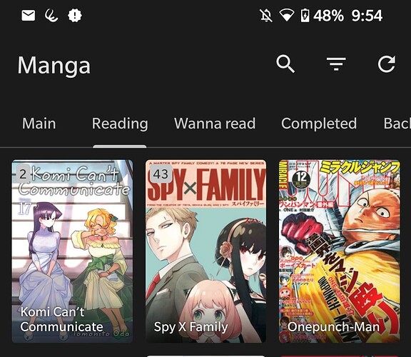
As a Tachiyomi user, I think it would be nice to have 2 line titles for the Continue Playing section, instead of a single one, as @ByteHamster says the font is small and some titles show a single word and stuff.
I believe something like what’s being done in Tachiyomi, showing the title inside of the cover art with a slightly darkened gradient to make the text easier to read.
Also, I think the way unread/new chapters are shown in tachiyomi is more modern than the current corner overlay.
I also like how the tab indicators don’t take over the whole tab space, but just the center portion. Of course this is not needed but more apps are using that approach lately, its Material You after all…
Hmm. I also miss the download state on these new horizontal episode lists. Like, you press the download button but have no indication of what is happening. The file size is not accessible at all, either.
I feel like that only solves one of the many issues this horizontal style has… ![]() My suggestion would be to simply use the normal episodes lists instead of this new design (even though it does look quite nice, it is is simply not as functional).
My suggestion would be to simply use the normal episodes lists instead of this new design (even though it does look quite nice, it is is simply not as functional).
I think this current style is nice as a default, also the episode lists are just one click away in the designated fragments if you click on the right blue button.
I’m not sure what use case you imagine @ByteHamster if you use the episode list a lot, than that could be solved with the bottom half implementation I had before and some sort of quickfilters, no?
An initial implementation of the home screen is now merged ![]() There is obviously still room for improvement – PRs and feedback welcome. The feature that would probably be most important as a next step is to add swipe actions to the home screen (they were available in the PR by @ueen but I removed them in order to keep the PR smaller/more manageable).
There is obviously still room for improvement – PRs and feedback welcome. The feature that would probably be most important as a next step is to add swipe actions to the home screen (they were available in the PR by @ueen but I removed them in order to keep the PR smaller/more manageable).
I was recently forced to use an iPhone a while and checked out Overcast. I feel like theres a lot to learn in terms of homescreen and adding podcasts (following is optional) in general, i feel like @keunes already took some inspiration for the initial homescreen proposal maybe?
I‘ll Check it out more, maybe somone has access to an iPhone as well, i would love to go in that direction more than Bottom Navigation. The Overcast homescreen is rather cleverly desgined and highly customizable.
Let me know if you would consider this direction and i would love do some work in that direction ![]()
Haha, no. Too much of an apple-antinfor that. But I take it as a compliment!
I took inspiration from the apps I had on my phone already, such as the public broadcaster, Spotify and Netflix. And my own thinking of what I would need. Others contributed ideas as well, here on the forum.
You seem to believe that bottom navigation and a good home screen are kinda alternatives, that we only need either. While I understand that with a good home screen bottom navigation is less needed, I still think we need to work on both.
Since we now have already the first (quite solid, if you ask me) version of the home screen implemented, feedback and further suggestions we maybe should cover in a separate thread. Please do create it (e.g. ‘Inspiration from the Overcast home screen’.) But would love to hear how you think it can be improved further in any case!
I foresaw some basic configuration of the homepage already (reordering and disabling blocks) but I believe that wasn’t implemented already. I think that would be the first thing to implement as a ‘minimum’, but can imagine much more customisation would be cool and possible. Gotta keep in mind also: who’s gonna implement and maintain all that if it’s complex. But let’s continue that discussion in another thread.
A post was split to a new topic: Further home screen improvements
