Further home screen improvements

The main thing i take away is certainly that overcast works just with a homescreen and without a bottom navigation, that is quite interesting indeed.

In general i would create a default UX that has queue and a list of all episodes (new on top) and add further customization like seperate inbox, statistics etc as sections (with links to seperate screens) to the homescreen, that can simply be turned on/off and reordered, much like the PR i had already. Im just not sure how much support there is to rethink UX in a more hollistic way which would include the alleviation of the subscribe first dogma.

To be honest I’m quite happy with the home screen I designed - I think it does include most if not all the elements you mention. I also can’t really visualise what Overcast looks like - how it looks/feels different from AP’s home screen, based on your description. Maybe if you could share a screen recording or screenshots that would help to understand what you mean.

I think there is some support for listening to episodes without subscribing. From what I remember, it’s mainly about how to implement it technically. See Add/play single episode without subscribing to podcast · Issue #4710 · AntennaPod/AntennaPod · GitHub.

I guess having that discussed & implemented would help for more holistic discussions. But that shouldn’t prevent us from improving the home screen I think.

I have two suggestions for the new home screen:

  • “Check your classics” suggest me several podcasts where I’d really like to listen to new episodes, but there are none. Maybe there could be some filter like “subscription counter > 0” or a non-empty episode list for this podcast. I usually set the episode filter to “not played” for each podcast.
  • On my device the splash screen is dismissed quite fast, but the app isn’t ready at this point and shows some skeleton views. The splash screen could be kept longer so the app is ready when it’s dismissed. See Splash screens  |  Android Developers for technical details.
2 Likes

“To be honest I’m quite happy with the home screen I designed”

I came here today out of utter frustration with the home screen. Sorry. It’s basically entirely unuseful.

The most useful and convenient screen to me is the Subscriptions scteen, which I can not set as home screen. It used to at least open to that screen if the app was left in the background with that screen, and I only had to manually switch to it on reboot usually, but lately it always opens to this useless screen that shows essentially random things I do not want.

They are all from my subscriptions of course, but they are selected using some criteria that isn’t anything I wanted.

The closest thing to useful is the continue listening section, but I only actually want one of those about 50% of the time.

All of the other options available on the configure home screen make no sense to me at all.

What I want is to see all subscriptions, and I select which one I want to listen to myself based on what I want at the time. I never want just whatever is next up in the random list of all my different subscriptions.

I went so far as to try other players but the next-best looking one on fdroid astonishingly needs a login to a server, to play locally downloaded files! Incredible.

Doggcatcher was pretty good for a long time but got buggy and I think maybe derelict. Maybe I should look at it again since it’s been a while.

The Subscriptions screen is still not ideal either, just it’s the closest. The ideal would be the Subscriptions screen, with indicators to show subscriptions that have downloaded episodes either in progress or not yet played. Right now they only have indicators for new available episodes not yet downloaded, and they disappear as soon as the download finishes, and then you can’t tell which podcasts have available episodes any more.

I’m sorry to complain but I’ve been trying to get along with it and figure out how it’s "supposed’ to work but it’s just not working, and by now I’ve let it drive me too crazy instead of just moving on.

This is a report from a user who absolutely can not stand the current home screen behavior, no matter what config options are tried. Ignore it if you think you know better I guess.
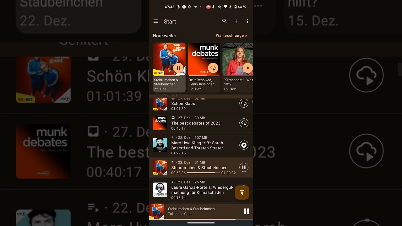
I’m willing to be more constructive with screenshots and more detailed explainations of what makes it so broken as it is right now, if it won’t be a waste of time.

You can just turn it off completely.

Why not? There is a setting for that.

There is a setting for that.

1 Like

Thanks for letting me know. [end sarcasm]

Maybe what would be actually constructive is saying what you do want; share example of what you would expect from a Home screen. Rather than explaining in more detail why you don’t like what’s there. (If you’re interested in a Home screen at all – seems you just want any other screen as default. Which btw is fine and possible.)

That might be a nice one indeed. Like, filter out podcasts that you have ‘completed’ already. However, when going that route, there might still be older podcasts which are listed because they still have quite old episodes unlistened (episodes that were released before you subscribed).

Right, I believe that’s still the case, e.g. for the Home screen. But at that point you can already open the side menu and go to another screen e.g. to add a new podcast. If until then we show the load screen and not allow you to do other things, you might be waiting unnecessarily.

Depending on the kind of podcast older episodes might be still worth to listen, so that shouldn’t be an issue IMO.

Another small improvement: The play/pause button inside the tiles on the home screen isn’t animated when changing between play and pause (and maybe between download and play, I haven’t tested that).

Hey its me - back again.
Love the new design and the new material feel and the material you integration!
But i still have my old UI/UX gripes and i believe firmley in the best ideas to bear out eventually.
So i’ll list what i believe to be improvements and try to implement, if its not more than maybe 2h of work so i at least can use it :slight_smile:

*if that might also be too much still, i would at least suggest having the filter button always visible in the toolbar in lists (space made available by removing the update button)

I think thats it for now, let me now your feedback (also lmk which you would accept as PRs :wink:
I hope you have reconsidered some gruges you held before and join me in getting AntennaPod further ahead. Just to reemphasize: with these changes it will be possible to design the homescreen so that you only have to use this one screen in the day to day, for many different usecases and preferences and this would remove the necessity for a ButtomNavigationBar, which i despise (its just lazy design).
Finally i wish you jolly holiday season and a happy new year :partying_face:

UPDATE: Took 4-5h but here are all changes in one new shiny branch, enjoy
feel free to improve on these or suggest ideas designwise, i focused on enjoyable UX functionality

Welcome back!

For me it is already that way :wink:

Hmm, I’m still not really convinced, to be honest. The cover is not really an “obvious” action button.

Note that you can now search new (online) podcasts from the normal search screen using one click.

K-9 mail seems to be getting some backlash after they removed the update button and replaced it with pull-to-refresh

Thanks for the near instantaneous reply!
I know these are all minor issues but i feel like these would result in great improvements :slight_smile:

The cover is obvious (for me) because it is clickable on the feed for example and it really improves prower usage, could be made optional i guess, but i would advice for default.
btw i remember an issue that prevented scrolling on the covers when they are clickable - at least on Android 14 and the most recent develop branche, that seems no longer to be the case

Didnt note the enhanced search: Awesome! Still would replace the refresh (unnecessary, confusing) with the add, so the sidebar doesnt even has to be opened on the very first use (also saves on click/slide for the sidebar).

We already have pull-to-refresh, so no replacement, just streamlining/optimizing and change is always subject to backlash, i’m open to hear a case for the refresh-button as i can not think of one my self. I only see it taking up up space that the filter refresh should take and it being hostile to one hand thumb usability plus possibly even hindering discovery of pull-to-refresh.

Would love to hear your thoughts on the rest, most dear to my heart are easy accessible filters in the episode list and lists on home screen :slight_smile:

I think there already is an issue for filter reset buttons. That sounds like a simple enhancement without any need for discussion :slight_smile:

I was hoping to have bottom navigation soon, then that’s also easier. For the bottom navigation, we need some elegant way to re-order menu items. That same code could also be interesting for re-ordering the home screen. So if you are interested in working on (re-)adding home screen ordering, that would be a great first step towards bottom navigation

Oh no I don’t want to work on bottom navigation, my case is that if home screen becomes useful and powerful enough there’s no need for the day to day use to resort either to sidebar nor bottom navigation, last of which has the huge drawback of permanently reducing available content space.

So to state my case positivity: make home screen unfold it’s full potential which will make sidebar use only rarely necessary, and with that remove the necessity for the bottom navigation :slight_smile:

:white_check_mark: reset filtermenu PR is opened
:white_check_mark: also cover to feed PR, its the same as on the individual podcast screen, where tapping on the cover also leads to the feed
(remove refresh button would be an easy next, the two big ones need more convincing i feel like:

Here is a preview with all of my improvements, see how nicely it can flow without the need for the sidebar or bottom navigation, even if it may not be for everyone - i find this to be an extremly fine UX and i would like to enable that for everyone to choose)

A post was merged into an existing topic: [HOME] feature expanable episodes list and inbox

So for a while now I’ve been utterly annoyed that I can’t easily refresh the feeds and have to constantly go to hamburger menu and select “update”. Why it was removed? There is sufficient space in the to toolbar…

Maybe it’s a “me-problem” and my particular use-case: I mostly stick in “Queue” view and (especially now) I’m going through my backlog (about 40 items). I’m going from oldest to newest and because there is no “stop after current” I use reverse sorting so the oldest episodes are at the bottom hence I’m stuck at the bottom of the view… I could probably scroll up and do “pull to refresh” but that’s somewhat inconvenient.

There is. It’s called “continuous playback” → off

There is a subtle difference - this is a global setting and not a “one off” thing thus if we want to listen whole queue by default (e.g. we go out biking and reaching for the phone to go to the next track is somewhat inconvenient at that time) we would have to change it constantly. My workaround for it was to simply put episode at the end of queue so it would stop after it and it works perfectly fine but… I can’t easily update the feeds because update button was removed :slight_smile:

Have you tried the “pull down” method to initiate a refresh? (No need to interact with a menu or any buttons.)

As explained earlier - if you have lot’s of episodes in queue and lack of “stop after current” thus having to put items at the end of the queue using “pull to refresh” is somewhat inconvenient as it would require scrolling to the top of the list :slight_smile:

That’s why I don’t usually initiate a manual refresh from my queue. :slightly_smiling_face:
(It also works from the InBox, home page, and probably some other places too.)

1 Like