Problem you may be having, or feature you want:
when reviewing my inbox, or any other screen that shows list of episodes, the title of the episode is often too short to have a clear view of the subject, IMHO. A longer title would be quite helpful.
Suggested solution:
Add an option to choose font size for lists of episodes, and show longer titles with smaller font size
Let’s make it configurable, then.
Because with the way I use the inbox, I lack information from the title to decide whether I should swipe to remove from the inbox or swipe to add to the playlist without needing to display the whole details of each episode. And keep the inbox neat and empty!
Currently I can see 7 episodes per scroll of my screen. Fewer episodes per screen (3?) if more lines of the description could get displayed. Scrolling through 20 episodes is easier than a long pause on 20 episodes.
Alternately, possibly format Inbox view differently than Episodes?
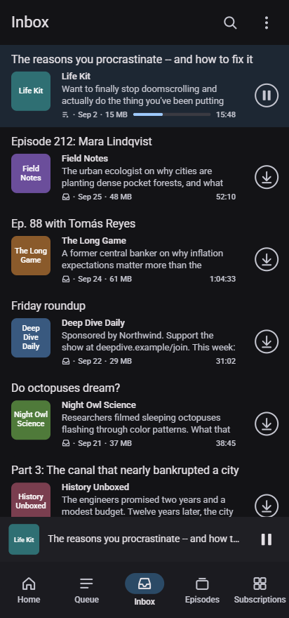
Along the lines of what has been discussed in this thread, I’d like to ask for feedback on a feature request that has been open for a while: showing a short excerpt of the episode description in episode lists (GitHub issue #6985). Many podcasts only put a guest name or episode number in the title, so I often can’t tell what an episode is about without opening it.
I posted a concrete proposal with a mockup on the issue here:
In short:
Optional, off by default. A “Show episode preview” switch under User interface. With it off, the lists look exactly as they do today.
Layout. Episode title on one line, then the cover with the podcast name and a two-line plain-text preview next to it. The status icons, date, size, duration, progress bar, drag handle and long-press menu all stay.
Where the text comes from. The shortest summary the feed provides (e.g. itunes:subtitle), falling back to the start of the show notes.
Performance. This was the concern raised on the issue. The preview is converted to plain text and cut to 200 characters once, during feed refresh, and stored in its own small column. Lists read only that column, so no full descriptions are loaded and no HTML is parsed while scrolling.
It passes the project’s checks (checkstyle, lint, unit tests, emulator tests) in my fork, includes a parser test, and I’ve been using it on my own phone. In the interest of transparency: the code was written with AI assistance, and I’ve tested it myself.
I haven’t opened a pull request because the issue still has the “Needs: Decision” label, and I understand from the contribution guide that I should wait for that. So my questions are:
Is this a direction the team would accept, at least as an optional setting?
Is there anything about the design or the approach you’d want changed before I open a PR?
I’m happy to adjust the design or the code based on whatever feedback you have.