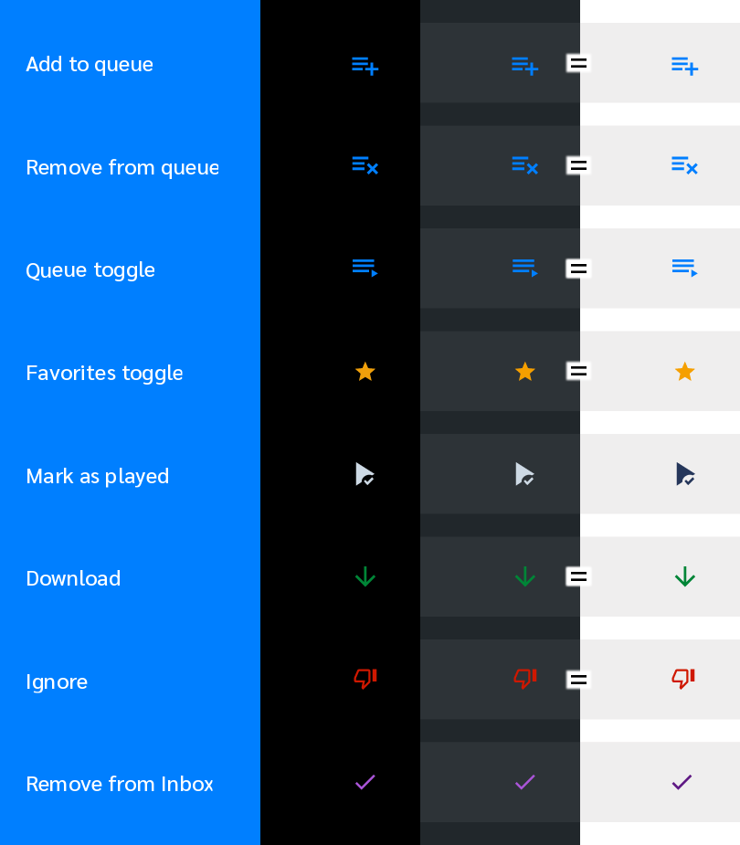
Behavior:
Played listings are displayed in ‘dimmed’ text, including the Favorites star.
(Using “dimmed” as a proxy for gray or whatever font effects indicate that something has been played, without knowing how themes interact with presentation in the app. I’m using a dark theme, and text appears gray.)
Feature request:
Make the Favorites icon pop by displaying it ‘undimmed’ and in a different color, such as ‘golden’.
Reason: I tag a podcast as a favorite because I may simply like it, but more often because it is important to me. I will delete downloads to recover space, and often feel a tiny anxiety that I’ll delete something important. (Also, I’m farsighted but use 3 powers of reading glasses for items closer than a meter.)
How does it work @ByteHamster? Does the whole item get some transparency? If so, changing the ‘standard’ colour to gold would also make the ‘faded out’ version also more legible.
Well, speaking solely for myself, if forced to choose, would put ‘non-grayed’ over ‘gold’ (or other color), because it’s the contrast from everything else that’s gray that would make it stand out.
I’m impressed with the array of UI items presented – did y’all whip that up on the spot?