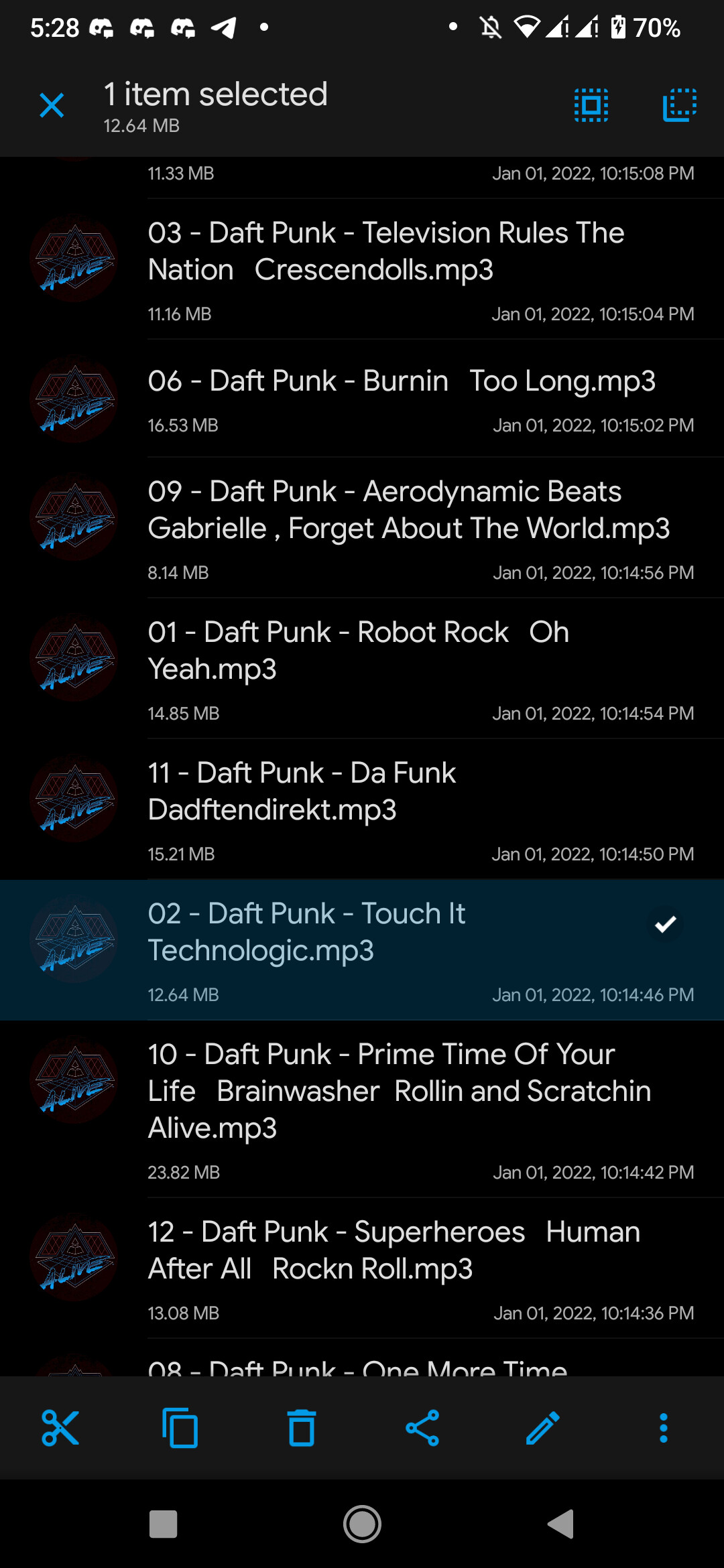
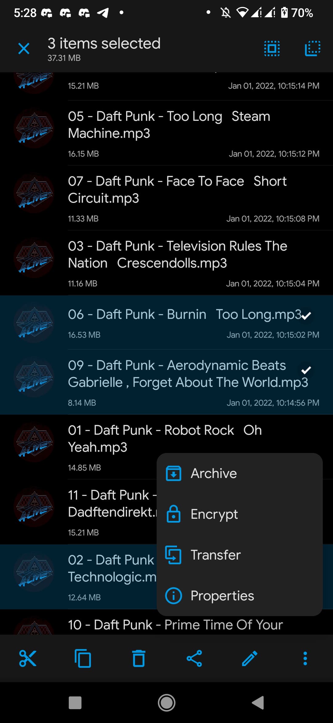
Problem you may be having, or feature you want (from the boyfriend): the multi-select button is a bit confusing (would expect three dots instead of the pencil) and I need an extra step to reach multi-select (first long-press, then multi-select). In Gmail a long-press activates multi-select immediately for the pressed episode, with key actions directly available in the top bar.
Suggested solution (from me): Do it like Gmail: long-press activates multi-select, and key actions appear in the top bar. We’d have to check if this works as the icons alone might not be clear enough. If the top bar doesn’t work, then maybe the FAB could remain – although that would mean that actions for a single episode would require an extra tap.
Screenshots / Drawings / Technical details: UX to be investigated.
I think we discussed this in the past and decided against it because it would mean that users then need to touch the top of the screen instead of the buttons being close to the episode. Isn’t multi-select a much less common action than normal select? I think we should optimize single-select usability over multi-select.
FYI as a new user I didn’t understand how to use multi select. It seemed like it wasn’t fully implemented because it didn’t seem like there was any action I could take once I selected multiple. I totally overlooked the pencil because to me, that is an editing type of action. It didn’t occur to me that a pencil would lead to a menu of actions such as “download” (the action I was looking for). A “…” button would be far more intuitive IMO, or anything else people would intuitively interpret as leading to a menu.
Only by coming here and searching did I find out the pencil is what I should use.
I didn’t think about it but I agree it is not as intuitive as it could be. I just tapped the Pencil icon anyway when I first started using AP just to see what if offered so now I know, I know.