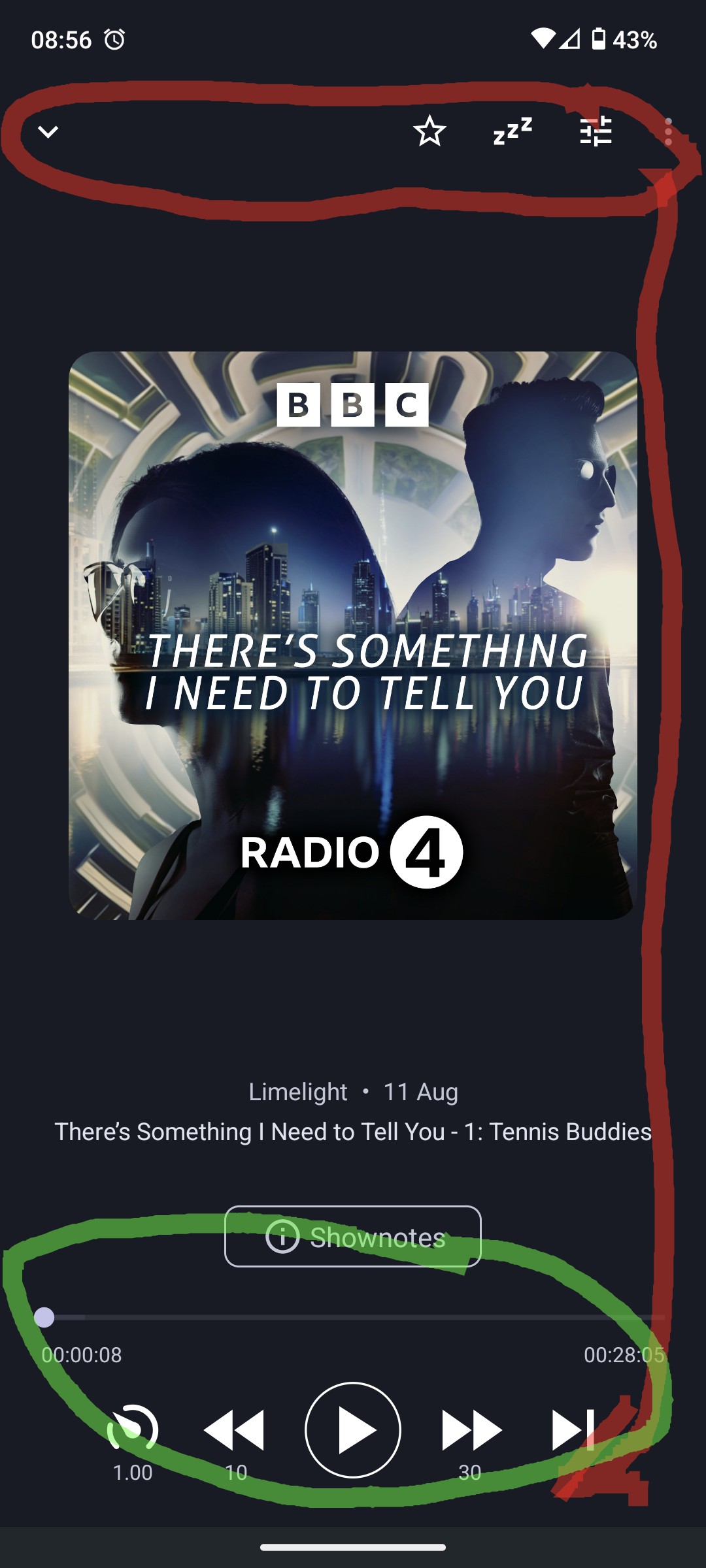
Could we have the sleep and other controls moved below the the play/pause and other controls?
Basically i have to change grip to reach both and i have large hands, most other media app do it this way
I’m on the fdroid release on android 13
Hi @podboi01
I’d be curious to see how exactly these other apps do it. To be honest, for the moment I’m not entirely convinced of the approach (while I see where you’re coming from).
The challenge is to make it all fit, without cluttering the screen. 'Cause these buttons on top are expected to be used less frequently than the ones at the bottom. Like favourite and the playback settings slider are hardly ever touched. In the bottom they would require extra space, while it would not free up the top bar (we cannot remove it like that).
Hi it won’t let me upload the images.
I’ve recently quit audible but that had the lay out I describe and audiobookshelf and vimusic (newpipe for music) do too these are all free (and great apps)
As for your concerns of crowding and making it fiddly they are not a problem in the above apps i don’t how the pull that off believe me i would be among the first to complain to them about fiddle things (I’ve mentioned the AP notification player bar cuz that’s too fiddle for me)
Keep up the great work
I recently changed from pocket casts, and the buttons at the bottom are quite uncomfortable.
Maybe not move the options from the top bar, but add some padding would be an improvement, so the play buttons are at the thumb resting position.
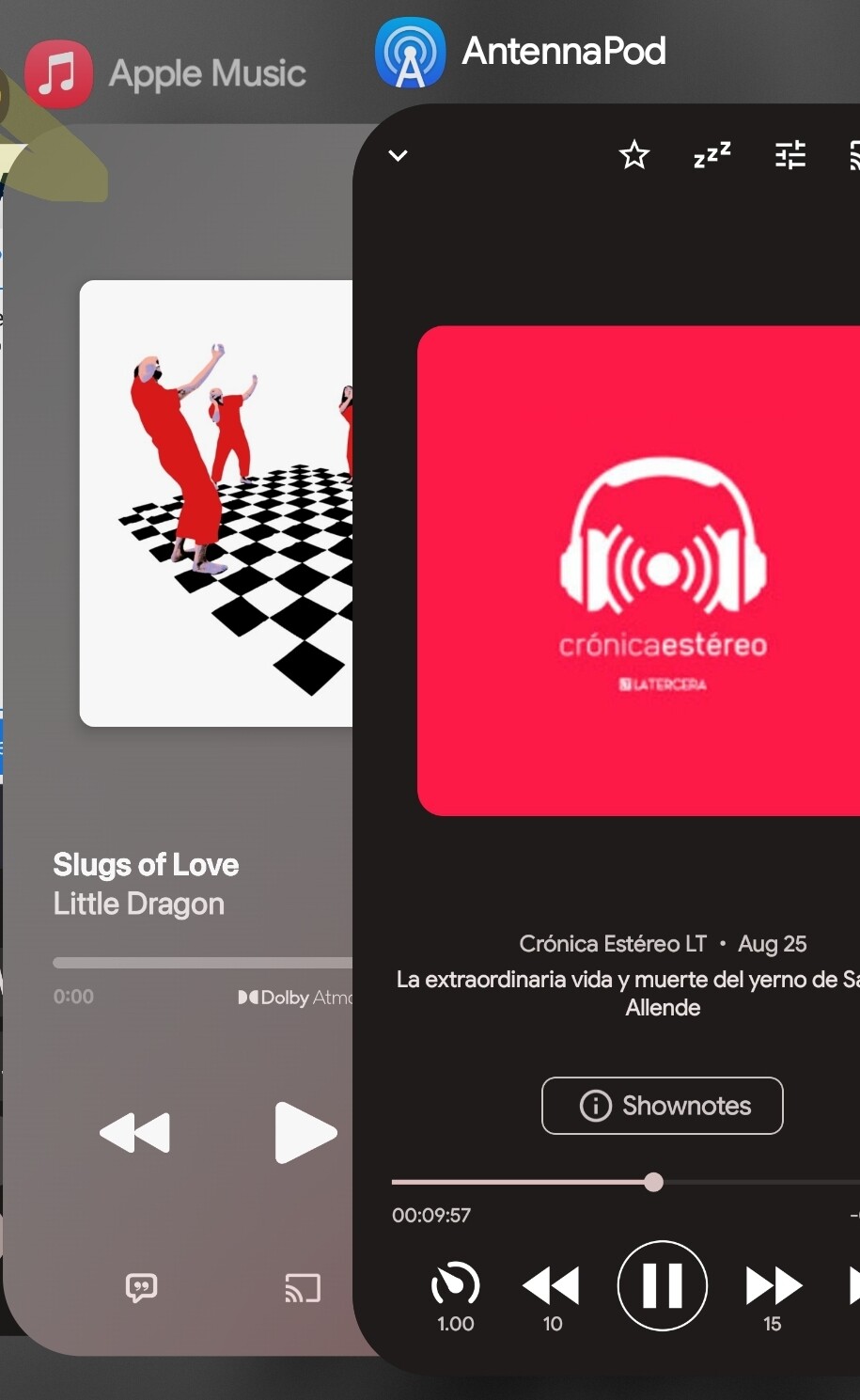
Most media apps have the play/back/forward buttons higher up that Antennapod (ie. Apple music).