Not without the chapter-view obstructing time increment navigation, right?
Part of the redesigned player screen would be to have both options accessible at the same time.
Not without the chapter-view obstructing time increment navigation, right?
Part of the redesigned player screen would be to have both options accessible at the same time.
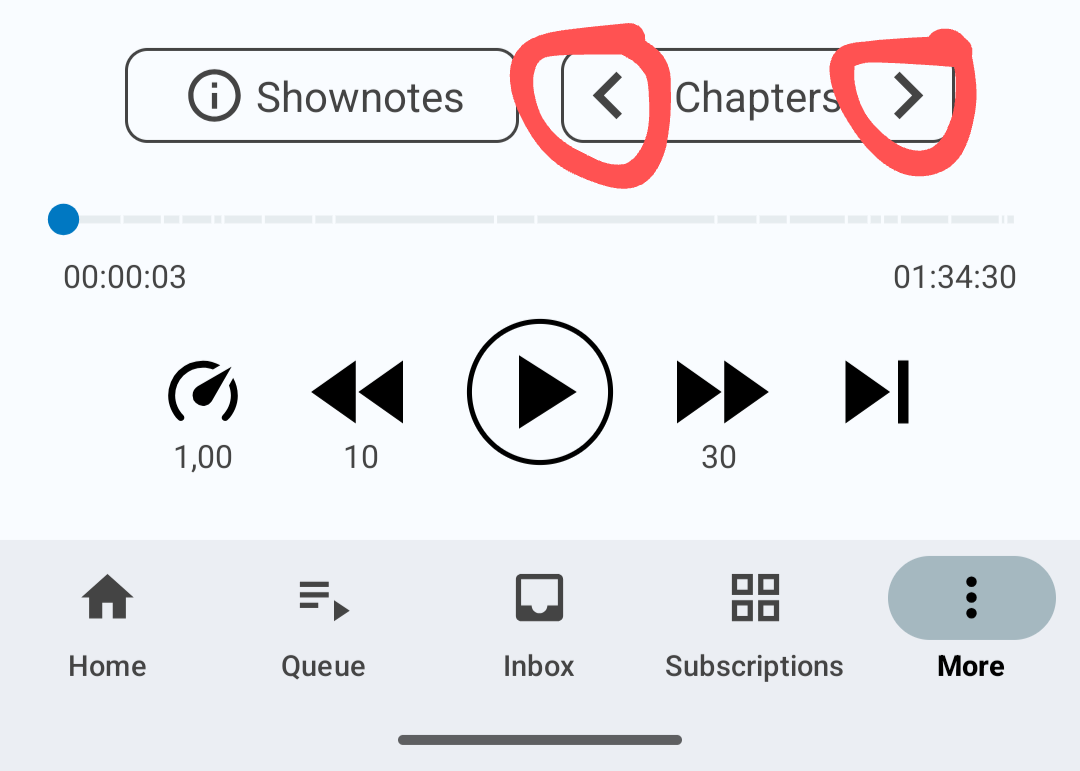
How can users see which chapter they are switching to and what current chapter is called? They can’t. So they open the chapters view, which then obstructs forward | backward time jump buttons.
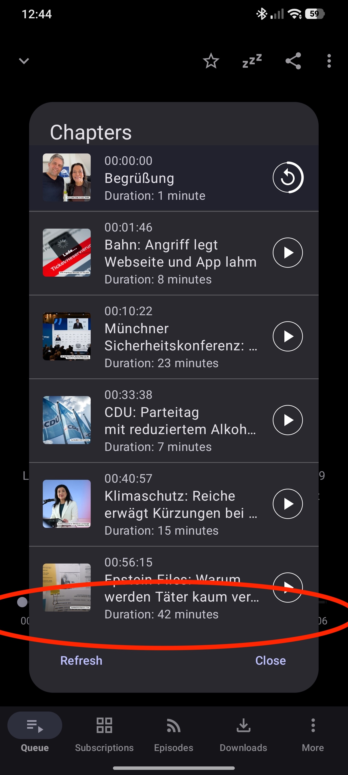
This three year old bug has a screenshot of how another podcast player solves this problem:
How chapter view is currently obstructing player controls:
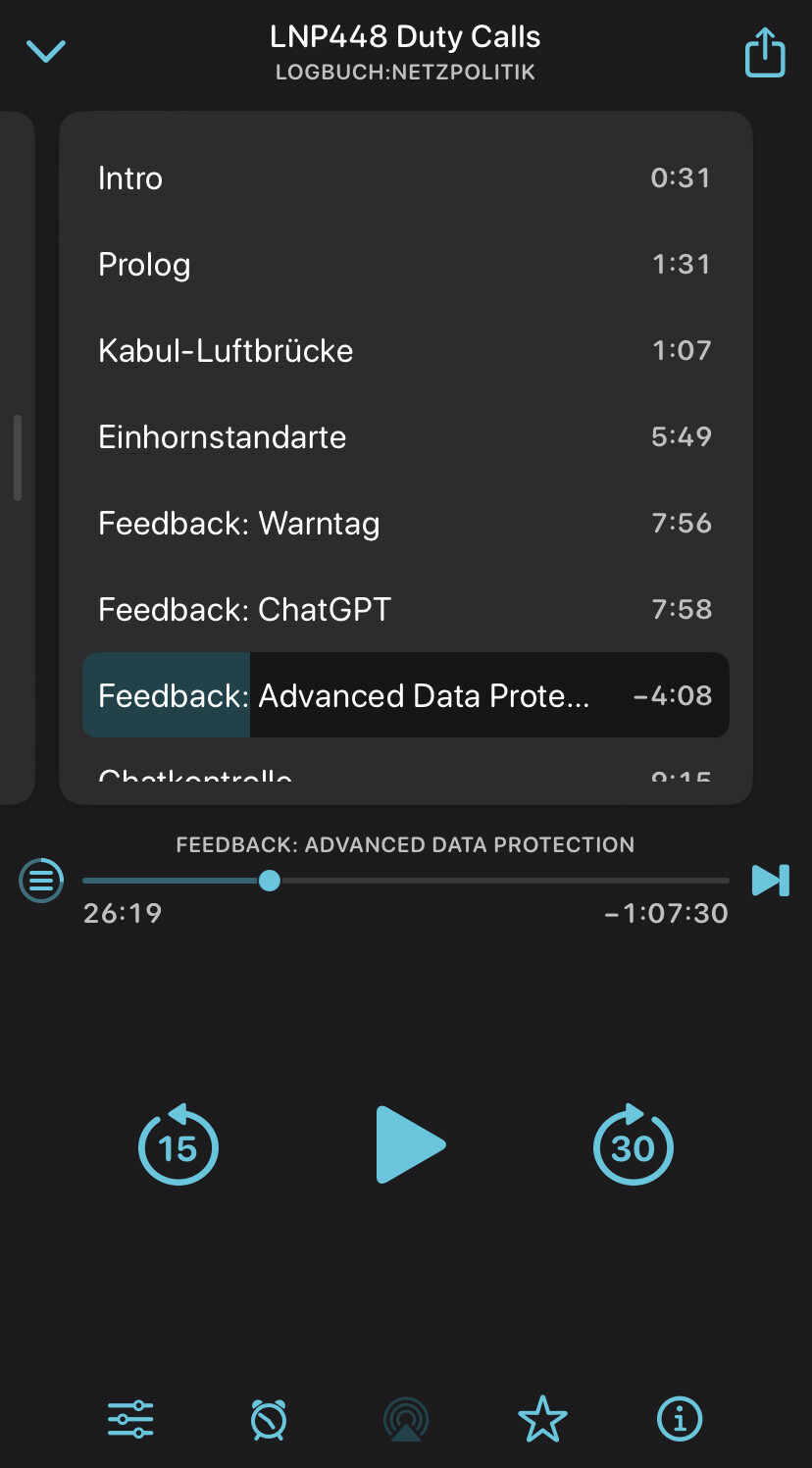
How to resolve the issue:
Does that make sense? I am slightly surprised to have this discussion many years after the issue was filed for this rather straight forward UX issue.
Hello, I just discovered and started using AntennaPod, coming from Pocket Casts. So far it’s awesome, great work on this. There is one thing that I miss though and that’s a way to mark the current podcast episode as played directly from the playing screen. Would it be possible to perhaps make the “playback speed” button configurable in settings to some other function? Like switch it to “mark current played”? For my use, I never change the speed so it’s a wasted button for me.
I don’t see any way to edit my previous message so I’m just replying again. I’ve since discovered that the setting “keep skipped skipped episodes“ turned off solves my specific issue, as if I skip an episode I have no interest in returning to it.
However, I still like the idea of making the playback speed button configurable in function if possible since each person will have different needs.
App version: 3.11.0
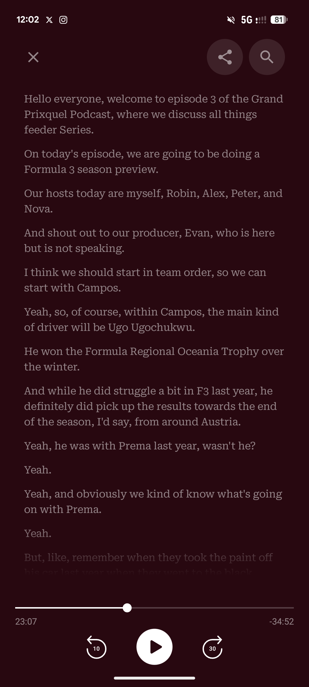
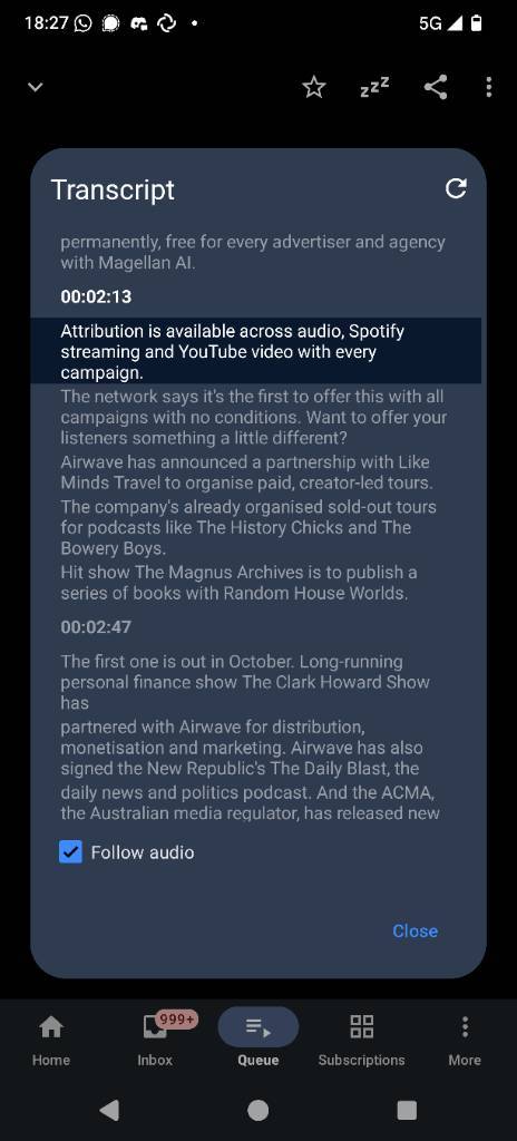
Problem you may be having, or feature you want: Full screen transcripts to the Now Playing window
Suggested solution: Allow for the transcript pop-up box to go into full screen, and take over the episode cover and title page.
Screenshots / Drawings / Technical details:
Something similar to Pocket Casts (attached) where you can view transcripts in a full screen mode that keeps it displayed when it is activated. Something similar also is in Apple Podcasts as well, which still keeps the episode title and episode cover visible.
Hi, that’s the plan ![]()
Is there any plan for the transcript to interactive? Meaning it highlights the current sentence, and you can tap sentences to go directly to that part of the pod? I don’t know it’s a priority, but would definitely add polish to the app.
Is that kind of timestamp information embedded in the transcript (ie is supported by the standard if the publisher chooses to take advantage of it)? Or are you suggesting the app analyses the audio stream to match up to the transcript?
Hello team @keunes , are there news on the progress of developing this now-playing redesign? ![]()
Thank you!
I was trying to see if it was possible to have the chapter titles showing in the now playing also, just so I could see them when my phone is locked or on the outside LCD when my phone is closed. It seems like such a small thing but it really makes a difference!
Oh, yes! That is a beautiful experience just like Podcast Addict app brings.
FWIW…
I never intentionally change playback speed (always leave it at 1.00) and never intentionally use the “skip to next episode” button. Yet I find myself accidentally hitting those on occasion, often without realizing it (either from the lockscreen controls or accidentally unlocking the phone.
It would be nice to be able to hide buttons I never use so that I can’t accidentally hit them.
Now, there are occasionally times I decide I don’t want to listen to a particular episode and want to skip it… but I would rather that be a two-step process (e.g. with a confirmation dialog or something). The inconvenience of accidentally skipping an episode I want to listen to happens more frequently than me intentionally wanting to skip one, so I leave “keep skipped episodes” enabled and instead skip by dragging the slider to near the end and fast-forwarding the last minute or three (of course, there’s a bug I need to report with this).