Swiping is extra; should be additional to UI (for discoverability)
Ideally, swipe action should be hinted by content. If not, at least by icons or text (e.g. tabs)
When navigating with 1 hand, key actions should be within reach of thumb, and navigating should be possible
Four navigational approaches:
Swipe up (transcript)/left (description)/right (chapters), as per User feedback: swipe navigation from player screen (2.3 beta) → No. You don’t have a preview of what screen will come up, and only on bottom you can show a preview of the content.
One long screen with blocks that allow to navigate to sub-screens, as Spotify does → No. Looks cool, but you don’t have direct ways to jumpt to relevant screen (always have to scroll vertically)
Tabs on top & actions buttons on bottom, swiping left-right switches between tabs, swiping up opens special screen (e.g. queue). Like Podcast Addict does, and as ByteHamster suggested. → Can be an option
Tabs on the very bottom, action buttons just above (still below main player buttons), swiping up opens the tabs, swiping left-right can be used for chapter navigation (if present for episode). → Can be an option
We’ll further explore the last two by making wireframes for them.
Alongside this work, we can create a survey to ask input from users:
What do you expect to happen when you swipe left or right?
jump chapters
jump episodes
jump functional screens
Which actions do you expect to use most often? (sort most → least)
[list of actions]
Which screens do you expect to use most often? (sort most → least)
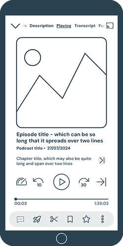
@Zehra_Rajnagarwala, @rauljimenez and I are ready to show the first wireframe of the approach we’re thinking of for the player screen. We’re hoping that the approach will make for a nicer design and makes some new episode features (like transcript) more visible (while accommodating space for all the Podcasting 2.0 stuff we might get in the future).
Before we will turn the wireframes into interactive mock-ups (that we’ll test with end-users), we’d like to show you the wireframe so we can make sure what we foresee is technically feasible.
We’d like to organise this in the week of 14 April. I’ve set up a poll to find us a date and time - hope you’re all willing & able to join!
Pay attention to the time zones - I only bothered to calculate two of them
Sorry for the late follow-up on the meeting. Here’s some notes of the comments and questions:
Swipe → do we allow endless swiping (circular; after last screen you jump back to the first) or do we implement hard ends?
How should the cover image be resized? It’s relevant in case of smaller form factors, or additional bar in case of insufficient boost budget, or long episode or podcast title. Keeping the cover horizontally centred while scaling down would look weird.
What if the podcast or episode title is really long? Episode detail screen is limited to 5 lines has vertical scrolling; could be similar here. We can also have different limits for episode (e.g. 3 lines) and for podcast title (e.g. 2).
Maybe better to move elements in top bar (Chromecast icon + overflow menu) to the action rail (overflow button there)?
Gives more space to screen names
We might also make a hard cut (or at least shorter fade) between tabs & overflow dots/Chromecast.
Accessing the sleep timer is now behind an overflow menu, while it’s more important/frequently used than some of the actions in the action rail. At the same time, some of the items in the action rail we might want to push more than the sleep timer.
Moving elements around would also break the logic of separating time-sensitive actions on the episode and non time-sensitive / actions not applied to episode.
Maybe allowing users to reorder action rail items could help; everyone can prioritise their own thing. (Adding an additional option like we did for bottom nav, but using iOS-style drag & drop, though complex to implement.)
What to do with empty screens, e.g. episode a) that doesn’t have comments or b) doesn’t support commenting)?
hide: empty screens without actionable paths aren’t great
keep: screens disappearing if an episode doesn’t have it might confuse users (where did functionality go?) and would break muscle memory
Confirmed that when clicking on the chapter title, you switch to the chapters tab.
We should add current speed indicator (actual number). We have to see how to do this; we’d want it to align nicely with jump back/forward numbers.
We should make a landscape version. Technical implementation: should be all or nothing approach; manually created version (rebuild layout) or let Android do it. Current manual, automatic would require revision throughout the app. However, we got few complaints from end-users on current state (which isn’t great…), so probably low priority.
We should still show playback controls on other tabs
initial phase: keep player controls and everything below on-screen
after: implement animation (controls could pop out with shadow, while progress bar & actions rail fade out, and controls block moves down) to reach state as per Raúl’s mock-up
Notes from our UX meeting on the points raised by the devs:
Hard ends
It doesn’t actually look that weird, we will horizontally centre it.
Another option could be horizontal scrolling like in Spotify. That could also work in other places (e.g. in episode detail screen). However, there are some accessibility downsides (and we can’t use hold to pause because that is already used for copying the episode title).
We’ll probably go with 2 lines max base, with a tap-arrow-to-expand like Pocket casts has on the Episode detail screen in case the title goes beyond 2 lines.
We move options in top overflow to the action rail
TBD if we have overflow button in the action rail or if we have horizontal scrolling like the tabs
Two options for the Chromecast icon: keep it in top bar consistently or have in the action rail in full player and on the right side for the mini player (like Spotify)
Action rail: disabled buttons (if tapped, there should be a snackbar saying ‘not available’)
Screens (tab): keep the tab but empty state screens
The biggest problem I see with AntennaPod is navigating chapters with the additional overlay, obstructing access to player controls. This is e.g. making it complicated to navigate chapters while also quickly scrolling into a chapter using the n seconds forward button to skip chapter intro.
Hi @bippenlal
Yes, work is still in progress - @rauljimenez, @Zehra_Rajnagarwala and I are working hard on it The issue you mention with the chapters will be addressed. Since we’re all volunteers it might take a while, but there certainly is a plan to tackle the issue.
Note that a wireframe is a rough sketch; there are elements missing (e.g. the sleep timer indication) and not everything is in proportion.
We’re currently working on creating the mock-ups, which have the exact design (typography, distances, colours, etc) as it will be in the app. Not just for the main player screen you see above, but also for the other tabs (description, transcript, etc).
We did do a study of 10 or so (wannabe) podcast apps out there, including the big names, to see the different approaches and check what could work for us. The approach we landed on, you can see above.
I would remove the player speed and skip to the next queued podcast to options to the bottom bar similar to how Pocket Casts does it. Most users aren’t going to use those and can change the buttons to the 5 they use while at the same time cleaning up the player itself. I’d also recommend changing to have the chapters page on either the left or right side of the player page. Cause those will be the most used pages and it just makes sense to have them together.
I’m not in favour of this, mainly because the logic is to group all playback buttons together (like on an old cassette deck) and all the buttons together for applying actions on an episode. And the screen will already be cleaned up by removing the ‘Shownotes’ and ‘Chapters’ buttons from that area.
Yes, we’ll need to see which order we’re going to place the screens in. Since we don’t have data, it’ll probably be based on educated guesses regarding utility and current use frequency.
I’m not in favour of this, mainly because the logic is to group all playback buttons together (like on an old cassette deck) and all the buttons together for applying actions on an episode. And the screen will already be cleaned up by removing the ‘Shownotes’ and ‘Chapters’ buttons from that area.
I understand what you’re saying, but how often are you changing the playback speed? I also see accidently hitting the next podcast arrow by accident while tapping the 30 sec skip forward being a thing.
I listen to podcasts about three days per week I’d say. I’d change the speed once every two weeks or so (it really depends on the podcast I’m in).
That said, while we’re using personal experience when working on the design, we are mostly focussing on making space for new features, cleaning up the UI and making the UX logic (group UI elements in a way that makes sense). So what I do personally isn’t too relevant here.
That said, I’ll pass on your comments to the other designers.
That shouldn’t happen - we’re following Google’s design guidelines regarding touch area (which white space around a button still activate the button) as well as margins between elements (how much inactive empty space exists between touch areas).
Was there progress since September 2025? skipping forward both by chapter and by time increments is my single most used feature in a podcast player as it helps me to get to relevant parts quickly.
 The issue you mention with the chapters will be addressed. Since we’re all volunteers it might take a while, but there certainly is a plan to tackle the issue.