System info
App version: 2.3.0-beta2
App source: Google Play
Feature description
Problem you may be having, or feature you want:
We have received feedback via email from a user about the update to the player screen, particularly the buttons to access the chapters and description.
I am currently using version 2.3.0-beta2. The last change of the navigation to the Shownotes and Chapter Marks I do not find successful. The previous arrangement with swiping to the left and right was much better.
I then asked why they found it better, and replied the following:
The new navigation is less pleasant for me to use. It is easier to swipe left and right than to hit the small buttons for navigation, especially at night when half asleep
I don’t know, it feels illogical to me.
Original emails in German
> Ich nutze zur Zeit die Version 2.3.0-beta2 Die letzte Änderung der Navigation zu den Shownotes und Kapitelmarken finde ich nicht gelungen. Die vorherige Anordnung mit Wischen nach links und rechts war wesentlich besser....
> Die neue Navigation ist für mich weniger angenehm in der Bedienung. Es ist leichter nach links und rechts zu Wischen als die kleinen Buttons für die Navigation zu treffen, vor allem nachts im Halbschlaf ;-) Ich weiß nicht, es fühlt sich unlogisch an für mich.
So there’s two things that I conclude from their feedback:
- this user apparently didn’t discover the down swipe option
- I think we can assume that users are used to left & right swipe because of previous behaviour
Suggested solution:
This made me think: Why don’t we allow for 3 swipe directions, where the shownotes gets to keep the same swipe direction as current:
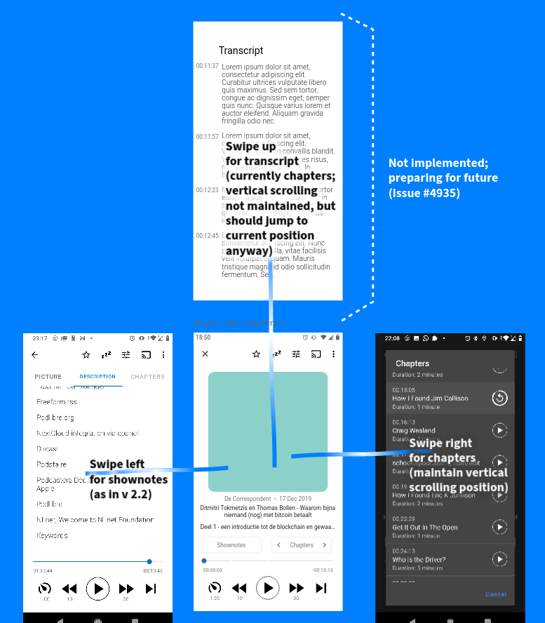
Swiping down of course closes the player fragment.
This would also address my personal feedback on the new player screen navigation:
- You have to swipe down to reach the description. In daily use, I find this a bit annoying: I want to quickly check something (eg. a link) in the shownotes and then go back to the screen with the image
- going back feels like a long thing to do, because natural instinct is to scroll up again, until the player screen, because scrolling down is how you got to the shownotes (even though you probably can also just hit the back button)
- you can’t maintain the the vertical position when doing the above
- if we have another feature that should be accessible from the player screen (like #4935), we have limited options: there’s no space really for another main button, and so I think it’d have to be an icon in the top bar.
Screenshots / Drawings / Technical details:
Of course this means extra work. But the current work to make downward swiping would not be lost as it’ll be used for the first next feature that needs a screen accessible from the player.
What do you think?
CC @ByteHamster @ueen @tonytamsf @Matth78

 )
) I was tempted to open a feature request about that.