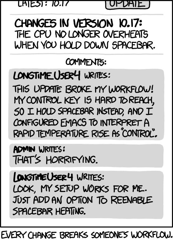
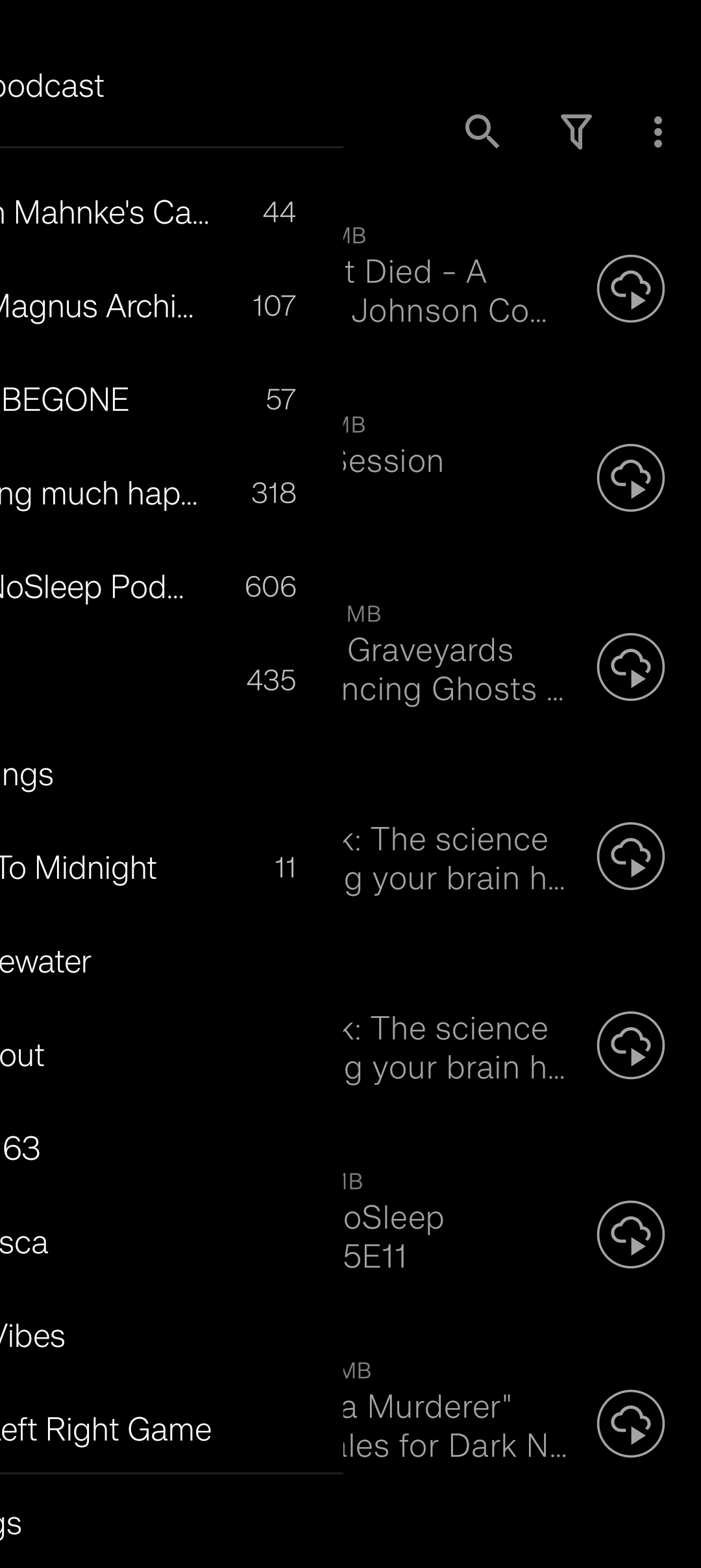
I understand that maintaining two navigation styles creates additional technical work, and I’m not claiming to understand everything that goes on behind the scenes. The examples you gave make the maintenance difficulties clearer.
That said, I’m not entirely convinced by the argument that other apps have been moving away from side navigation. Apps like YouTube and Spotify have had bottom navigation for years, so this isn’t exactly a new development. But that doesn’t necessarily mean side navigation has become obsolete or that bottom navigation is automatically the better choice for every app.
For example, Podcast Addict (if I’m remembering correctly) still uses a side navigation menu to access its various sections. This shows that the approach is still relevant, even within the same category of apps as AntennaPod.
Ultimately, I think AntennaPod should be judged by its own needs and the way people use it, rather than simply following what other popular apps have chosen. I still believe a community poll would have been a reasonable way to determine which navigation style users would prefer to keep if maintaining both is no longer practical.
I just wanted to explain why I think retaining side navigation would have been a better fit for AntennaPod and its users.
I understand now that the decision has been made and that it doesn’t seem likely to change at this point. So rather than continuing to argue over which navigation style should stay, I’d like to suggest a few improvements that could make the new layout feel more polished and less cluttered.
When I’m listening to an episode and the mini-player is visible, having it stacked directly above the bottom navigation makes the lower part of the interface feel quite bulky. The two elements look like separate layers placed on top of each other rather than parts of a cohesive layout. I’d like to see them integrated more naturally so the interface feels less cluttered.
I also noticed that the bottom navigation remains visible even when opening an episode in the full player. This wasn’t something I was used to with the old side navigation, and I found it particularly inconvenient when navigating through muscle memory. I often use the app while working with my hands or without looking directly at my phone, so I rely on knowing where the controls are. With the new navigation in a different position, I kept tapping the wrong things without realizing it until I looked at the screen. I’d much prefer if the bottom navigation could be hidden on screens like the full player and individual podcast pages, rather than remaining visible everywhere.
One other thing I’ve noticed is the spacing between subscriptions on the dedicated Subscriptions page. I know this page has always been available, with both column and list layouts, but I personally prefer the more compact appearance of the subscription list in the old side navigation. Since the available space there was narrower, the subscriptions were displayed closer together, which I found much cleaner. If possible, I’d like to see the list layout on the dedicated page offer similar spacing or give us more customization options.
I realize these are ultimately design decisions, but since it seems we’re going to be moving forward with bottom navigation, I think addressing these points would go a long way toward making the new interface feel more seamless and less cluttered.
Thanks for taking the time to explain everything and consider my feedback. I appreciate it.
 Don’t remove side navigation entirely.