I’d like to suggest a possible improvement to the playback screen UI.
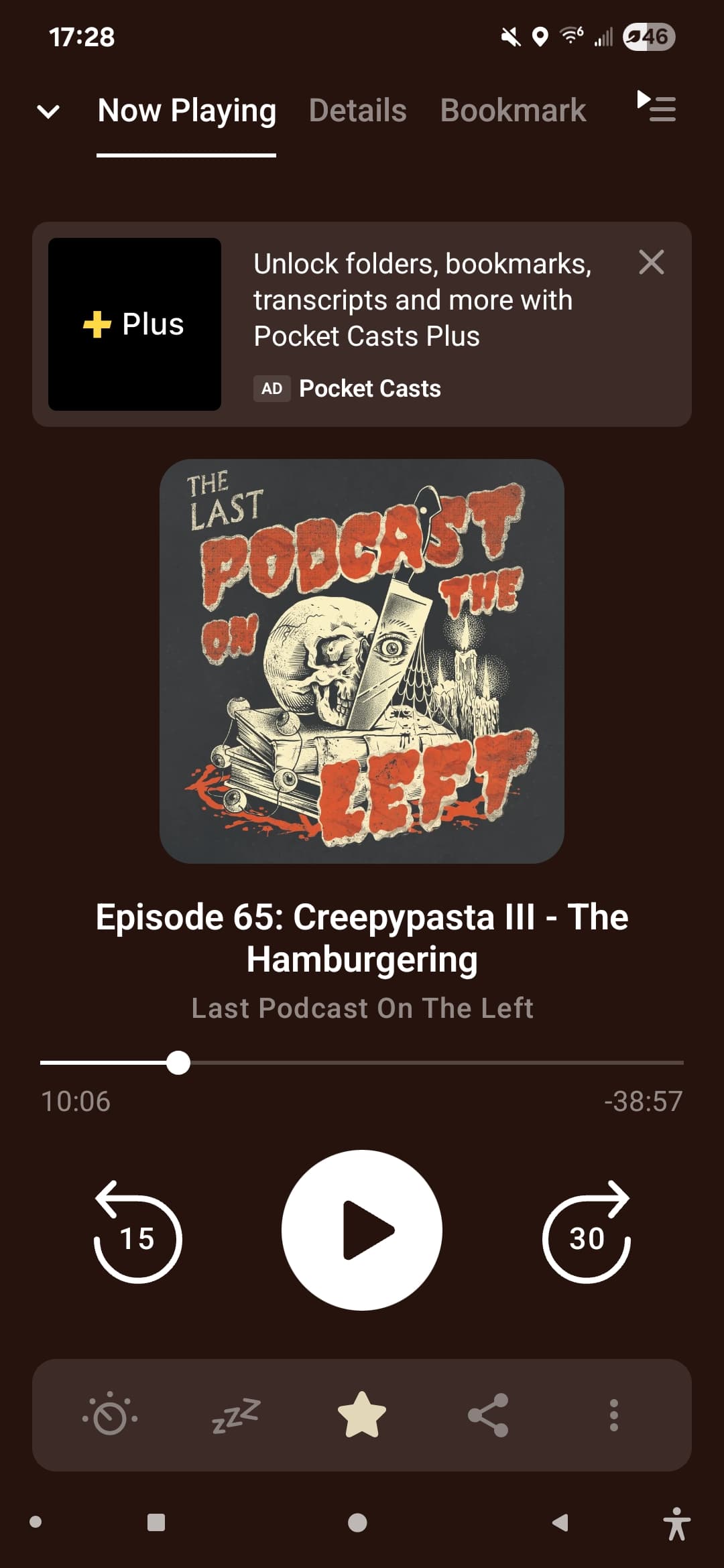
Currently, when playing an episode, AntennaPod displays all the relevant information by default. If the user wants to view the full show notes, they need to either swipe upwards or tap the “Show Notes” button underneath the episode image. While this works, it can sometimes feel a bit hidden or unintuitive.
I think it could be worth considering an alternative approach, similar to how Pocket Casts handles this.
In their player screen, they use a simple three-tab layout at the top:
-
Now Playing
-
Details
-
Bookmarks
Users can switch between them either by tapping on the tabs directly or by swiping left/right.
This tabbed structure makes navigation between playback controls, episode notes, and saved bookmarks feel faster, more consistent, more polished, and easier to discover for new users. It also helps keep the UI clean while still allowing quick access to everything.
Would the team be open to exploring a similar layout option for AntennaPod?