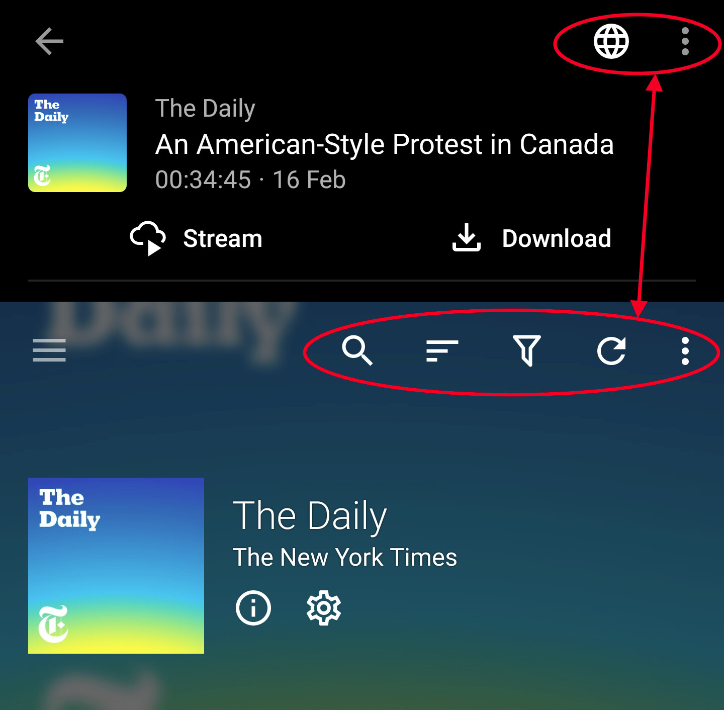
The Episode screen only has three quick actions: Stream, Download and View on Web.
To “Add to Queue” tapping the dot menu appears to be unavoidable?
I generally like to browse episodes and enqueue them in batches for later listening, so the two-step process of opening the menu feels especially cumbersome in what is otherwise the pleasantly streamlined process of browsing by swiping.
Since there is a lot of free room especially in the top bar, I was wondering why at least some of the most common actions weren’t given an icon, as in the Podcast view, which has four?
Downloading an episode should also add it to the queue. Maybe it would be an idea to replace the download quick action with an add-to-queue action for users having AntennaPod configured to prefer streaming. Would that be an improvement?
Not sure I’d want to lose the Download button, TBH.
As you correctly guessed, I haven’t used that option all that much as I’m relatively new to AntennaPod and thus far I have listened to podcasts only at home where streaming seemed the way to go.
However downloading would seem a useful option to retain in other scenarios.
Not to harp on, and I appreciate AntennaPod has to accommodate devices with smaller / lower res screens, however I don’t understand why it is OK to have many buttons on one screen, but not on the other?
Honestly interested in understanding the thought process.
Wouldn’t it be confusing to have Queue as a separate action if Download (and queue) is already there?
My assumption is that users generally have a listening pattern of either always streaming, or always downloading. We have of course no way of knowing whether mixed usage of those patterns is common. I’d say those wishing for that level of control can be expected to tap twice, as the alternative could cause confusion for everyone else.
If queuing multiple episodes without downloading them (and having a mixed listening pattern), how can you be sure to still be on wifi when listening through the queue?
First impression input is most welcome. Thanks for giving it! Do you think you would be able to perhaps use the functionality for a while and follow up again? Maybe you might still think more buttons is the way to go. It is also possible we might learn that the better solution might be another one.
When it comes to mark as played, that option is intentionally not as easily available because it is supposed to be a uncommon action. There are interesting threads in the forum about being able to filter on new episodes and/or marking episodes as ignored.
I generally download over wi-fi to listen to while out and about but there are occasions I want to download or stream over mobile but for me these would be actions that need not be on the Quick list.
Nope, as is shown by Add to Queue already being a separate option, the matter is merely whether it should be more accessible.
That won’t be necessary. Having to aim for the dot menu and then scan the textual menu is a snag, and feels incredibly slow compared to having an action in the top bar.
It will never feel good, and remains a sore spot in the interaction flow.
The only reasons I can see in favor of stuffing options in the dot menu, is to remove clutter that might make the app confusing / harder to use, for seldom used options and others that might benefit from an extra degree of protection.
Except The Episode View has no clutter, and Add to Queue doesn’t need to be protected.
Having options buried in the dot menu might also lead some users into thinking they are not there in the first place, so having them within comfy reach is in my eyes a Very Good Idea™ that has at the moment no obvious drawbacks.
(Other than someone has to approve the idea, and the work/time required to implement it, which I would if I could)
Only if it remains a part of the normal interaction flow after allowing once usage pattern to mature. My suggestion was that you gave it some time, to see whether you’ll still operate the app in the same way once actually having experienced queued episodes prior to leaving wifi et cetera.
Let’s not make the mistake to chase minimalism for minimalism’s sake, because that ends with less being simply less.
I do not mean to sound rude or confrontational, BTW, but you are insisting that adding a couple buttons would make things confusing? I cannot even argue against that because I find it so patently untrue, at such a low level, that it should be immediately recognized as such.
There is a screenshot in the OP that shows another screen having four buttons in the very same spot, should those buttons be removed to make the UI more clear? I don’t even think that would the final effect, it would be counterproductive, actually.
That and other arguments are based on what you yourself recognize are assumptions about the way the app is used, and formulated on limited available data.
I have put some data on the table, whose validity you question because I made the mistake to write that I am “relatively new to AP” which BTW means I’ve been using AP on and off for over two years, and more intensely in the past two months or so.
Other people’s habits and ways of thinking and relating may seem alien to us, but they’re no less legit than our own. As someone who has helped countless people with computers, I recognize there is sometimes a need to steer folks towards better ways to do things, but I don’t feel there is a need for me to be steered on this particular issue.
The queue does work as a holding area for stuff the user wants to listen later, so adding to queue should not be a second class citizen, and if anybody asks me, I cannot imagine that the button that opens that Episode’s web page sees more use, but it’s there nevertheless.
Indeed I did place high importance to your claim that you were new to AntennaPod, and I did make the assumption that you were posting ideas that you might actually change your position on once they matured. Posting ideas before every detail is considered can be a valuable thing, as phrasing ones thoughts is necessary for them to actually mean something.
That said, I never saw any response to this:
In my opinion it the usability aspect of being able to listen to things in the queue weighs high. My original suggestion of replacing download with add to queue in case the user prefers streaming still seems like the more reasonable change.
Please consider the users preferring download because they are on expensive data plans. Would you consider the value to save a few clicks when using the app in a quite uncommon way to be higher than that of limiting the risk that even one individual gets a phone bill ten times more expensive than expected?
Why would you not be prepared to set your preference to streaming if that is your preference? What am I missing?